We asked our customers what would they do if we weren’t around?
They told us they’d attempt to build it on their own, look for an open source plugin, try a cheap commercial plugin
from one of the marketplaces like Codecanyon or start looking at
complex commercial libraries like Kendo UI, Syncfusion or DHTMLX.
Turns out none of them are great options, and here is why:
Not efficient
No technical support
Accessibility and compliance missing
Increasing maintenance cost
Requires technical expertise
Not polished UX
Abandoned projects
Platform inconsistencies
Half-baked documentation
Bloated
Hard to set up
Not mobile friendly
Hard to customize
You get what you pay for
Limited
Building it on your own
Open source plugins
Complex commercial libraries
Cheap commercial plugins
1. Building it on your own
No technical support
Not efficient
Accessibility and compliance missing
Increasing maintenance cost
Requires technical expertise
2. Open source plugin
No technical support
Accessibility and compliance missing
Not polished UX
Abandoned projects
Platform inconsistencies
Half-baked documentation
3. Complex commercial libraries
Bloated
Hard to set up
Not mobile friendly
Hard to customize
4. Cheap commercial plugins
Hard to set up
Not polished UX
Abandoned projects
Platform inconsistencies
Half-baked documentation
Limited
You get what you pay for
There is a better way
Based on what our customers value the most in Mobiscroll this is how we are different from DIY, open source & cheap plugins or complex commercial libraries.
Get started quickly and easily. No matter the framework, installation is simple.
For jQuery and Javascript you’ll just need to include
the resources in your project. In case of React, Angular and
frameworks like Ionic you can use the Mobiscroll CLI
to install the products with a simple command.
Use only what you need, don’t rewrite the whole page if you don’t want to.
When using any of our components, you don’t need to change the whole experience. If it’s just a piece of the UI you’d like to implement with Mobiscroll that’s fine.
We play well with other libraries, so don’t need to worry about conflicts.
Backed by dependable support
Get things done with the help our support engineers.
Our idea of great support is providing the help you need to unblock yourself.
Get the help you need to make progress and deliver great experiences.
Platform specific look & feel for iOS, Android & Windows
Deliver a consistent experience with the platforms you are targeting.
Our components are built following the design guidelines
of the major platforms so that you can provide a familiar UX to your users.
Truly responsive
Support all the screens, no matter if small or large.
All components are mobile first while supporting screens all the way to desktop.
Your users will be covered by a great experience on touchscreens with touch optimized UI
and on desktop as well.
It matters… there are differences in touch area and size, hover effects and clickable elements.
Has a polished UX
Use best in class tools that are also used by companies with thousands and millions of users.
That means the components are tested not just by us but by all the people who use software with Mobiscroll in it.
The components are getting better and better.
Use a familiar API across components that cover most use cases.
The tools are constantly evolving to fit your workflow, help you be more productive
and cover new use-cases that are expected by developers from various industries.
Fine-tune the the functionality above what’s supported outside of the box.
Tap into the lifecycle of the components through a number of event handlers to really deliver experiences that make a difference.
The components are built with extension in mind, and the tools for that are already there.
Deep styling capabilities
Customize the look & feel to match your brand and fit with the overall product.
Theming being one of the core features, you can use the dark & light variants
or add your own colors with the theme builder. Refine further with Sass and CSS overrides.
Well documented
Find what you are looking for in the detailed technical documentation.
Look through our collection of constantly evolving and living documents with detailed API docs,
descriptions, guides and examples.
Enjoy development time validation with typescript.
All versions of mobiscroll come with TS definition files which is used by advanced IDEs like Visual Studio Code.
Auto-suggest helps you be a more efficient developer.
Easy to set up
Get started quickly and easily. No matter the framework, installation is simple.
For jQuery and Javascript you’ll just need to include
the resources in your project. In case of React, Angular and
frameworks like Ionic you can use the Mobiscroll CLI
to install the products with a simple command.
Use only what you need, don’t rewrite the whole page if you don’t want to.
When using any of our components, you don’t need to change the whole experience. If it’s just a piece of the UI you’d like to implement with Mobiscroll that’s fine.
We play well with other libraries, so don’t need to worry about conflicts.
Backed by dependable support
Get things done with the help our support engineers.
Our idea of great support is providing the help you need to unblock yourself.
Get the help you need to make progress and deliver great experiences.
Platform specific look & feel for iOS, Android & Windows
Deliver a consistent experience with the platforms you are targeting.
Our components are built following the design guidelines
of the major platforms so that you can provide a familiar UX to your users.
Truly responsive
Support all the screens, no matter if small or large.
All components are mobile first while supporting screens all the way to desktop.
Your users will be covered by a great experience on touchscreens with touch optimized UI
and on desktop as well.
It matters… there are differences in touch area and size, hover effects and clickable elements.
Has a polished UX
Use best in class tools that are also used by companies with thousands and millions of users.
That means the components are tested not just by us but by all the people who use software with Mobiscroll in it.
The components are getting better and better.
Use a familiar API across components that cover most use cases.
The tools are constantly evolving to fit your workflow, help you be more productive
and cover new use-cases that are expected by developers from various industries.
Fine-tune the the functionality above what’s supported outside of the box.
Tap into the lifecycle of the components through a number of event handlers to really deliver experiences that make a difference.
The components are built with extension in mind, and the tools for that are already there.
Deep styling capabilities
Customize the look & feel to match your brand and fit with the overall product.
Theming being one of the core features, you can use the dark & light variants
or add your own colors with the theme builder. Refine further with Sass and CSS overrides.
Well documented
Find what you are looking for in the detailed technical documentation.
Look through our collection of constantly evolving and living documents with detailed API docs,
descriptions, guides and examples.
Enjoy development time validation with typescript.
All versions of mobiscroll come with TS definition files which is used by advanced IDEs like Visual Studio Code.
Auto-suggest helps you be a more efficient developer.
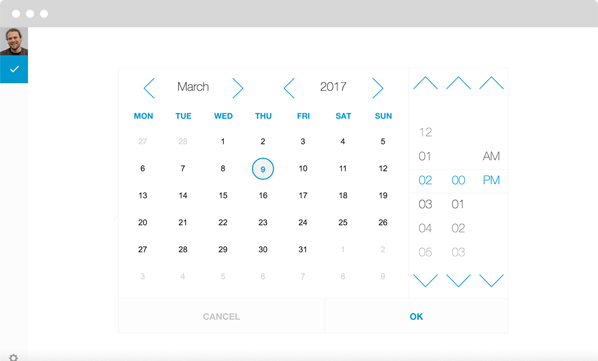
Desktop
With more than 15 million users, Any.do helps people organize their lives and get things done.
They use the Mobiscroll Calendar with Time Picker in their web app to help users schedule their tasks.
With more than 15 million users, Any.do helps people organize their lives and get things done.
They use the Mobiscroll Calendar with Time Picker in their web app to help users schedule their tasks.
Desktop
Meet the components
We are shipping UI components to cut serious development time.
Date & time pickers
Handle almost any date and time picking challenges thrown your way.
Shipping with calendar view, date, time and timespan scrollers the components are ready for mobile,
touch devices, kiosks all the way to fully fledged desktop web apps.
Use it to build a mobile friendly calendaring and scheduling experience. With the help of the calendar view, week view, scheduler, timeline and agenda you are covered for most use cases.
With built in resources, drag & drop, optimized mobile & desktop interaction, work week & hours combined with deep customization... there is much to explore.
