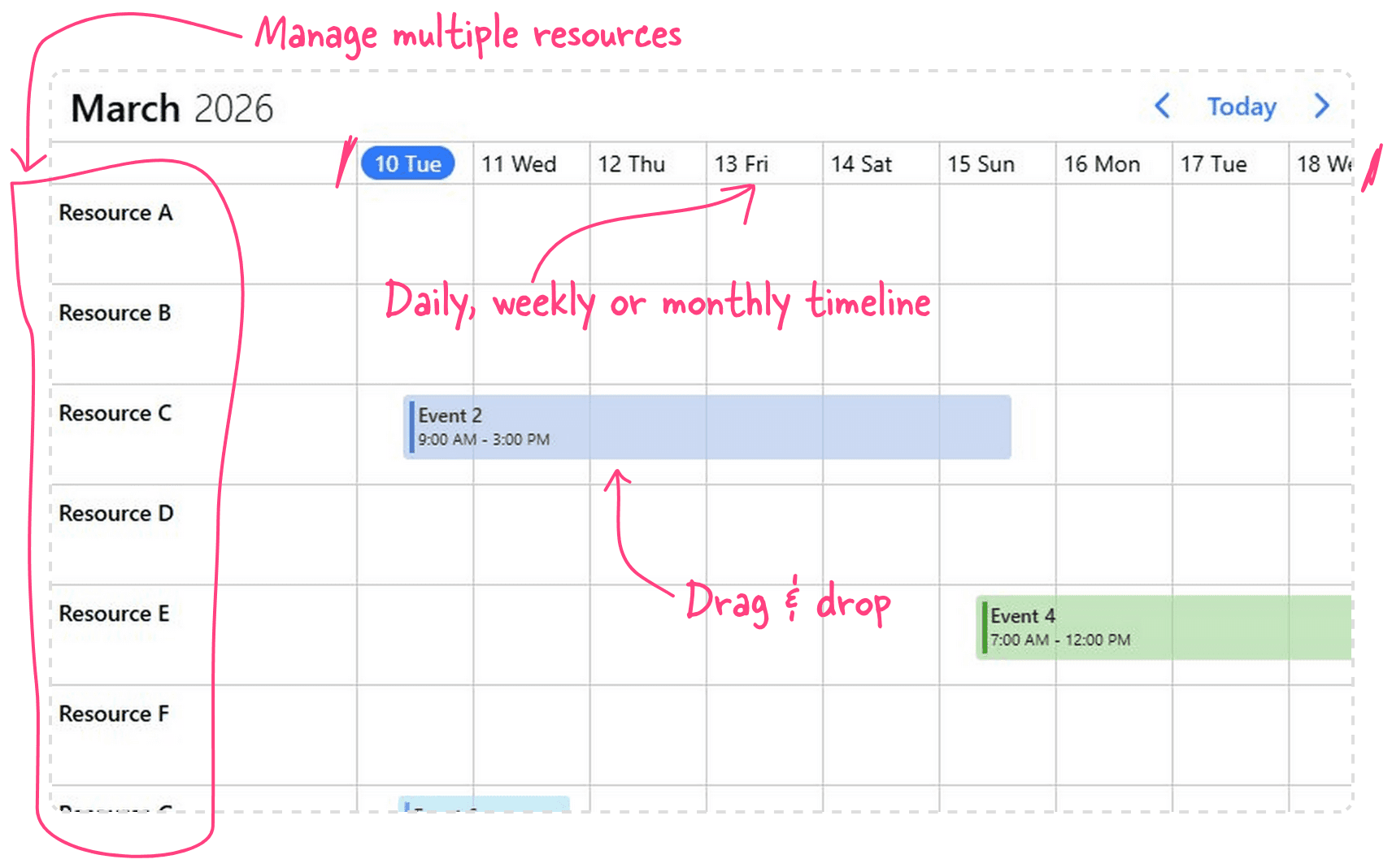
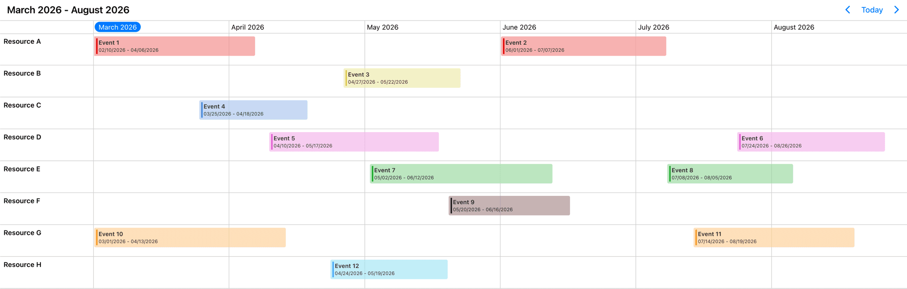
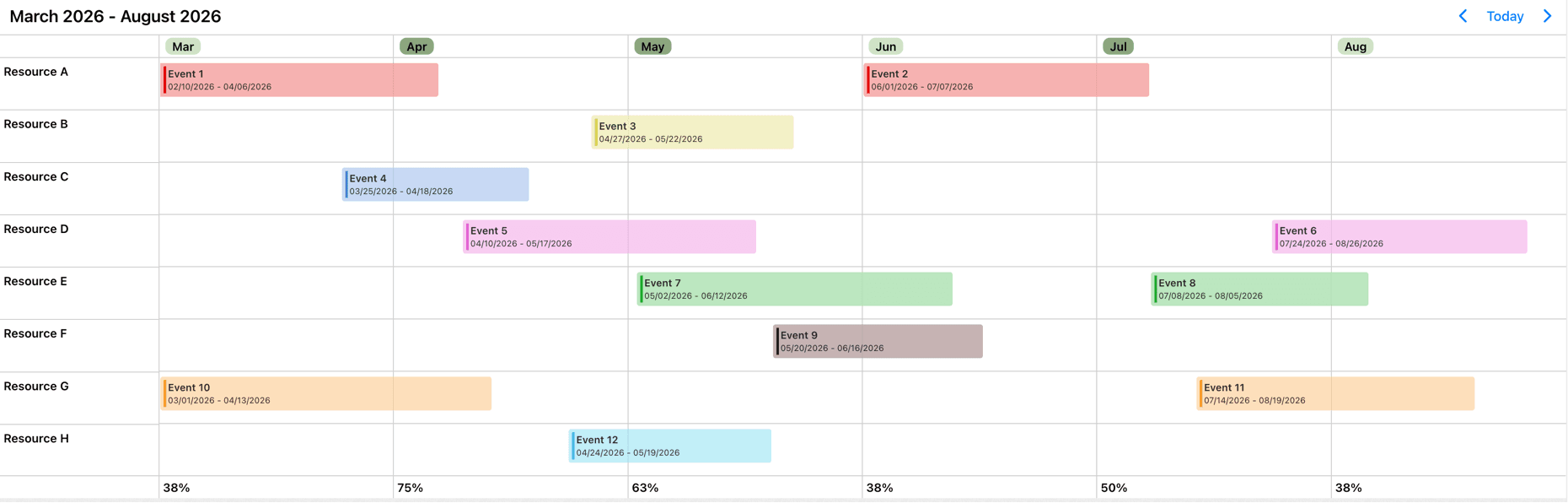
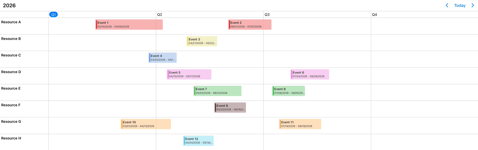
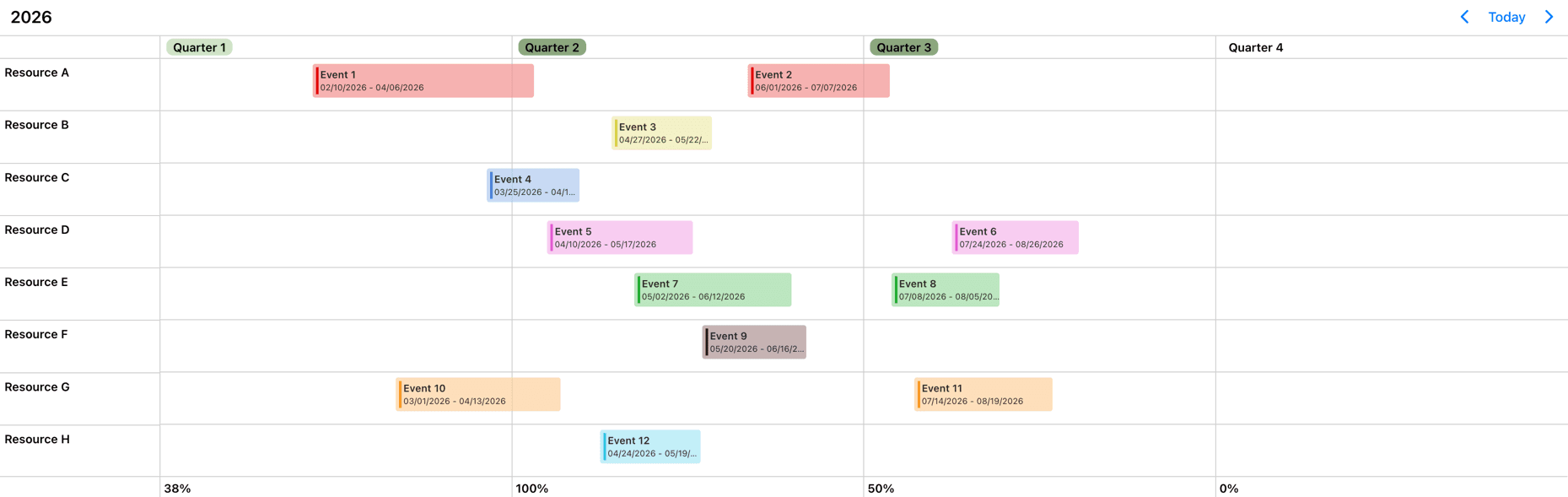
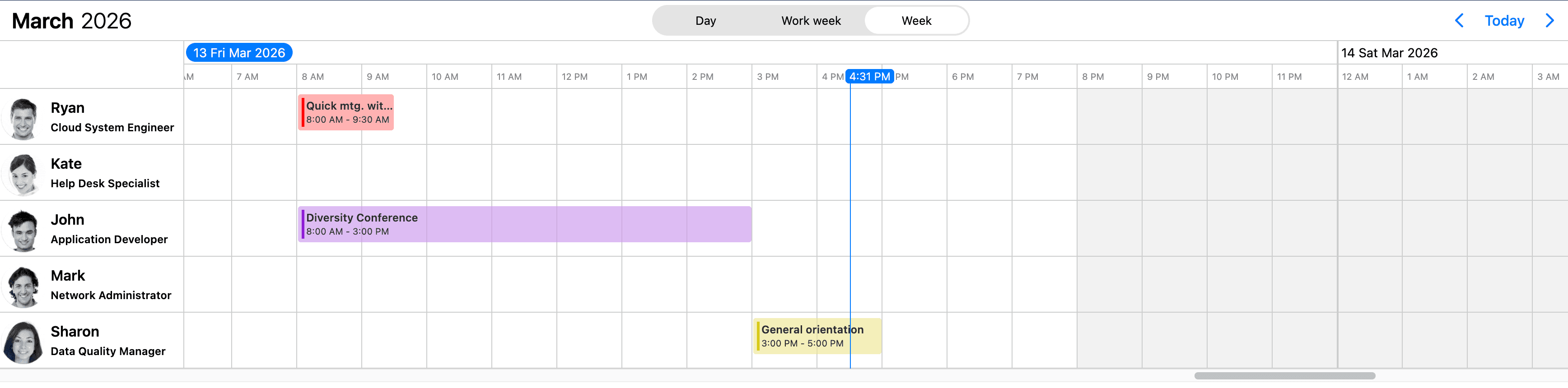
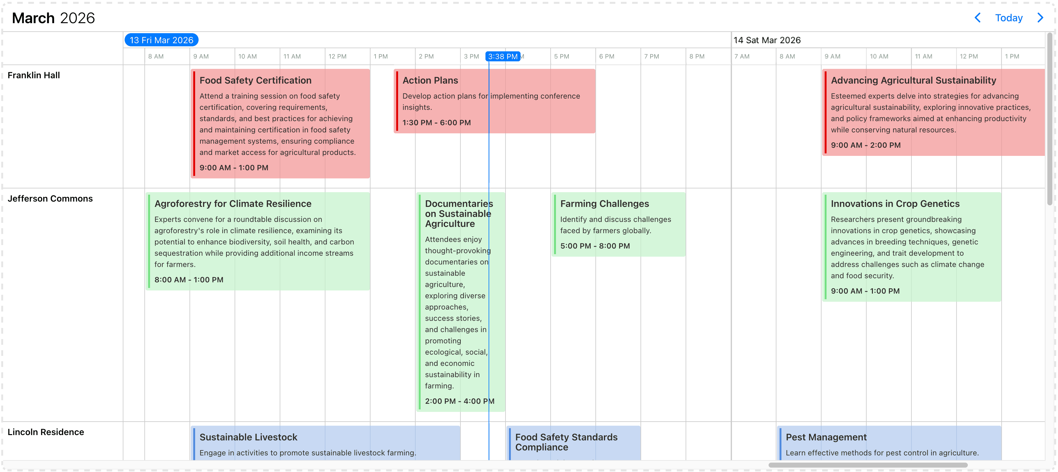
Timeline
Use the Timeline view which features a horizontally scrollable view with multiple resource support for day, week, work-week, month and year view with built in templating, drag & drop and more.
Overview
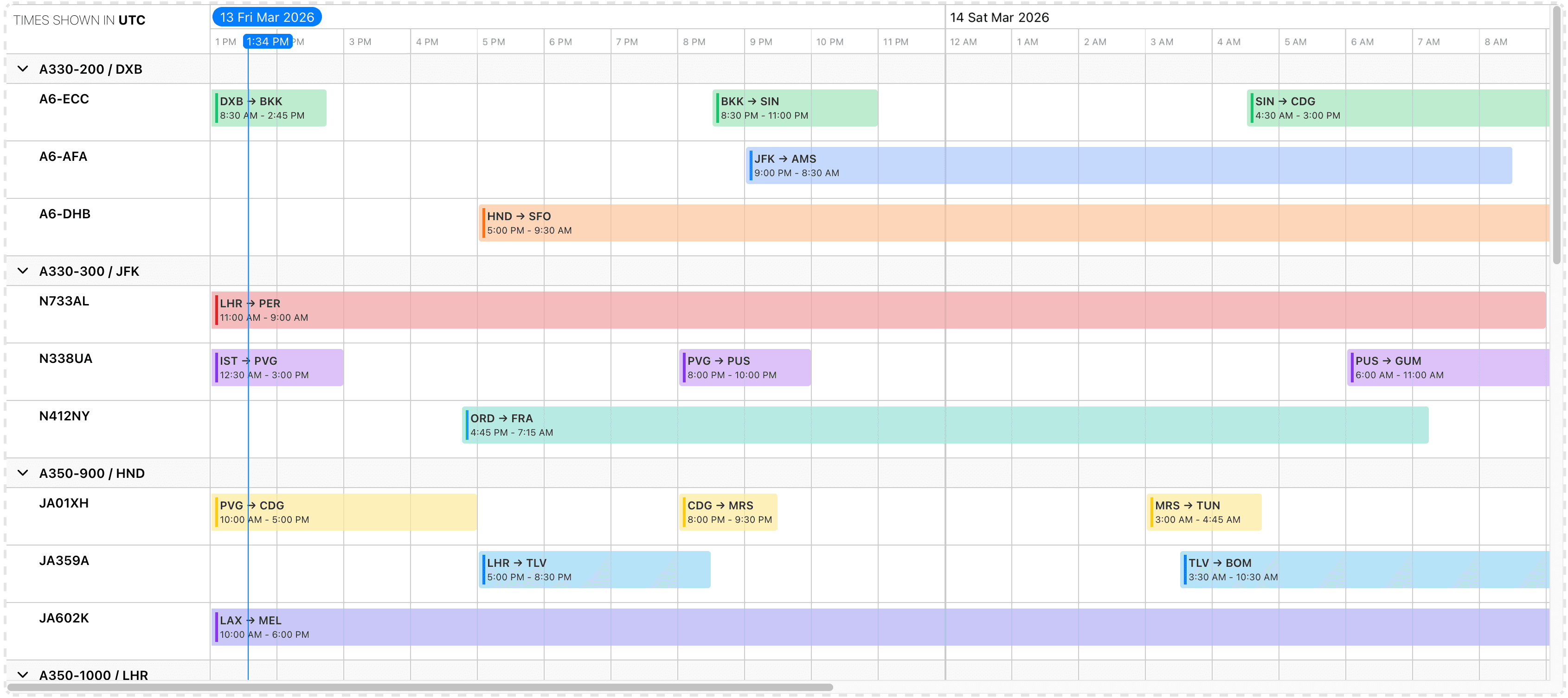
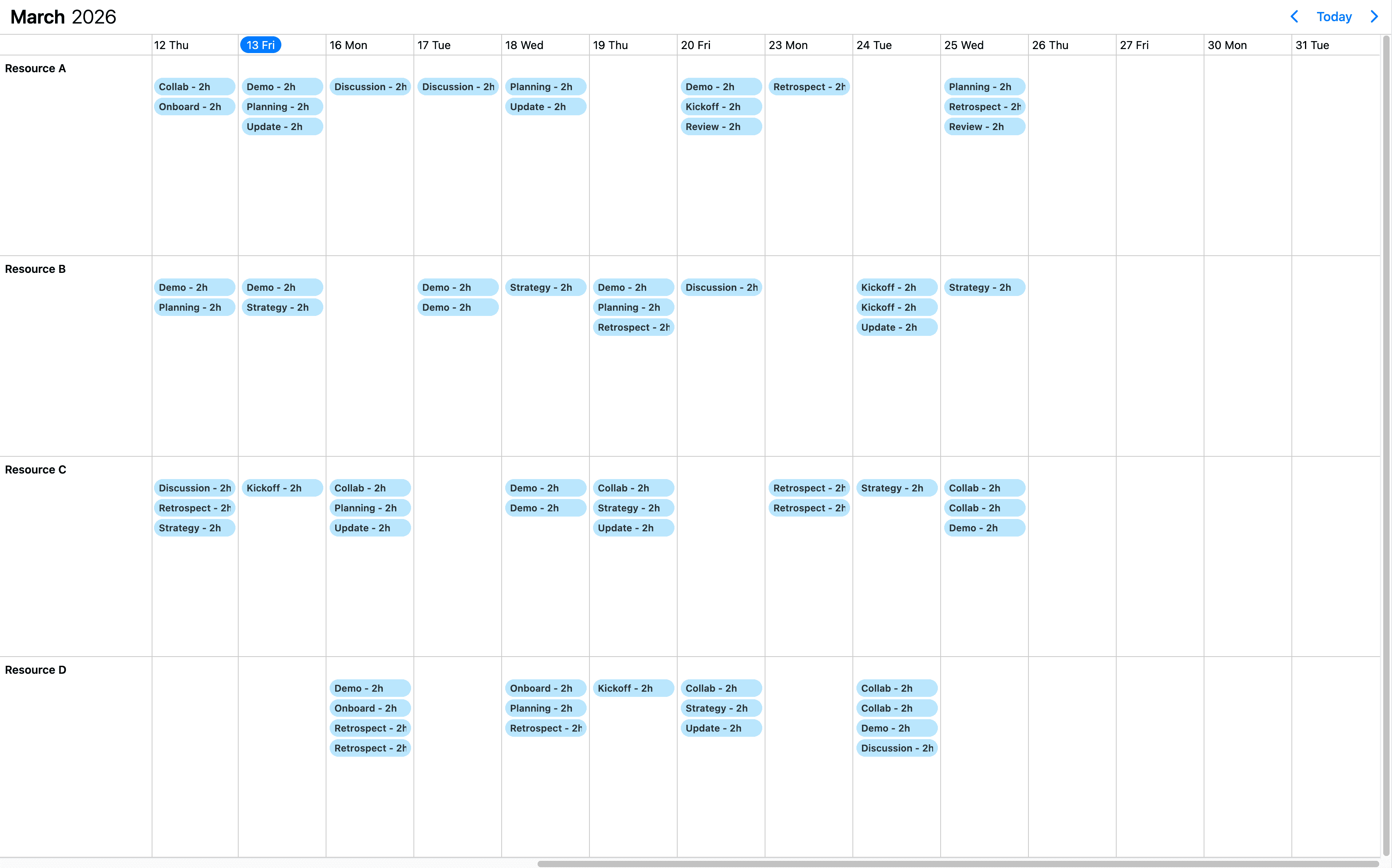
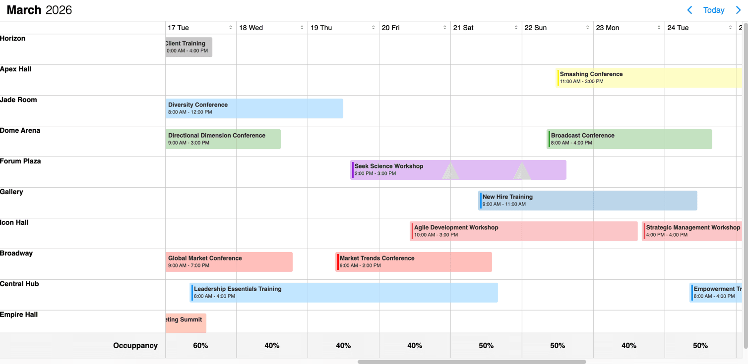
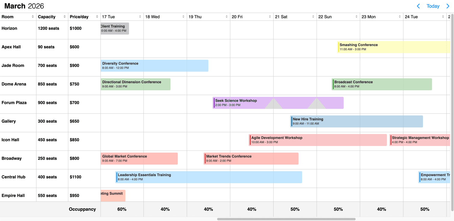
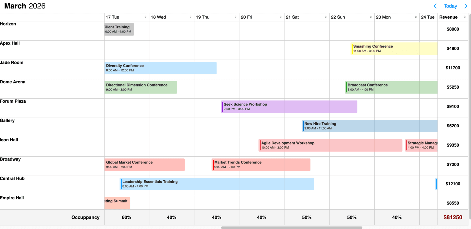
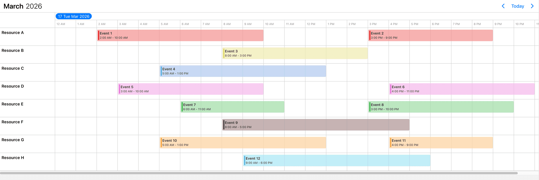
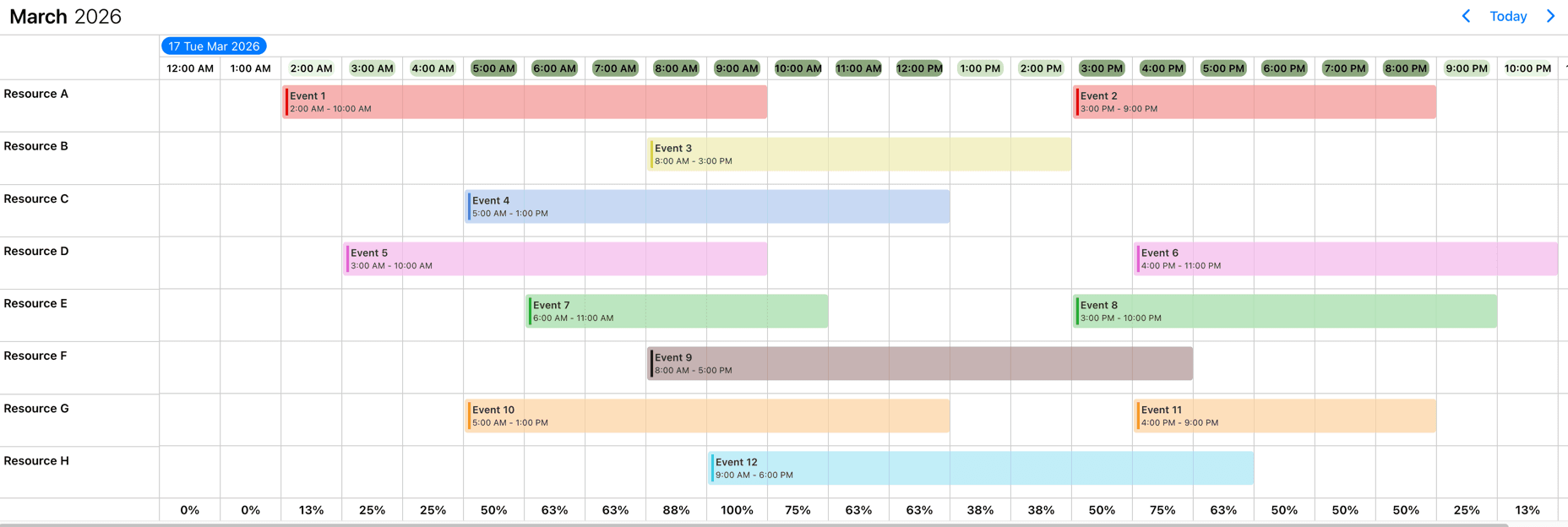
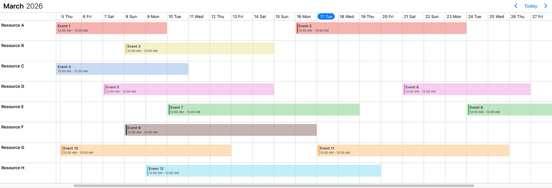
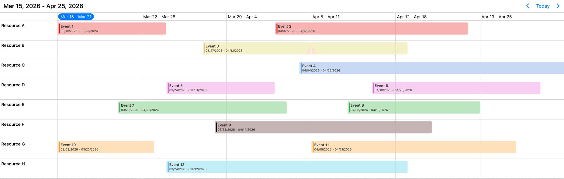
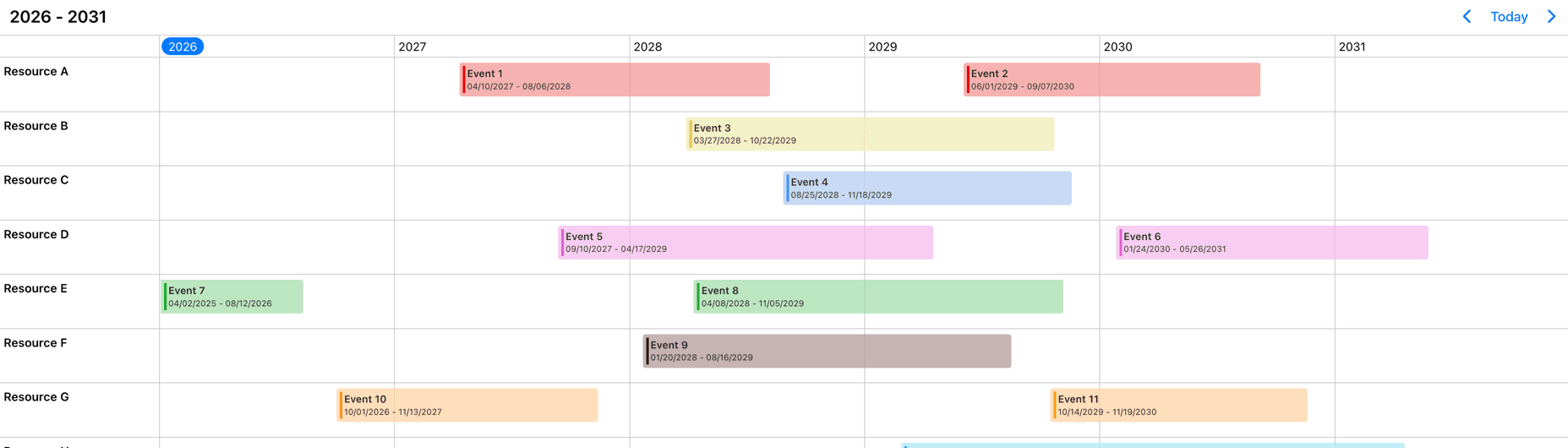
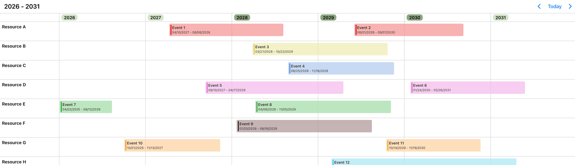
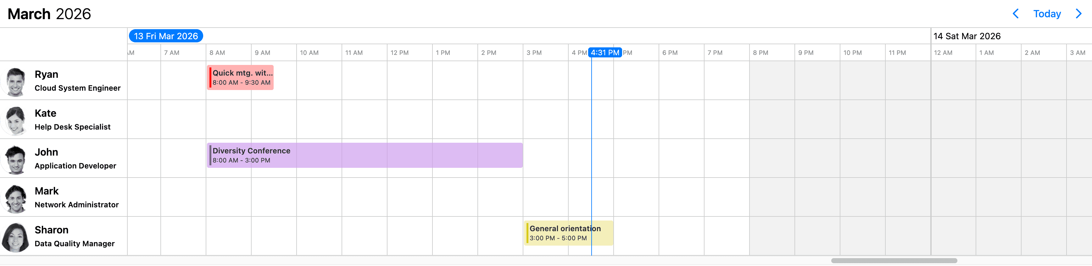
This Timeline view displays a timeline with its related events. You can render the times/days horizontally and the resources vertically. The Timeline can easily accommodate a large number of resources thanks to the vertical scroll that is easy to understand for users. This plays well on larger screens and in landscape containers. Work hours and work days along with disabled time-spans, breaks can be added. Use it to for advanced tasks with built-in drag & drop.
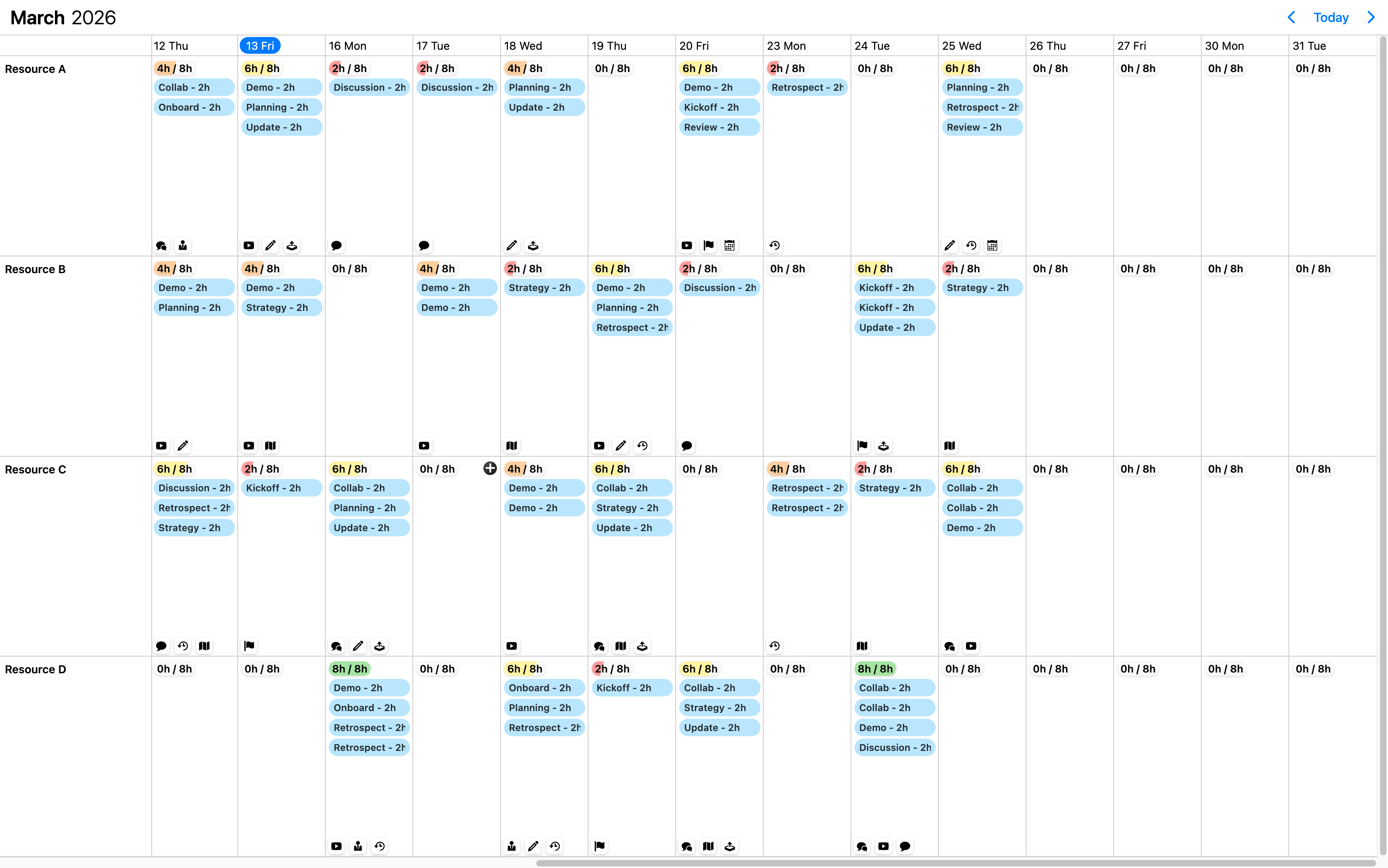
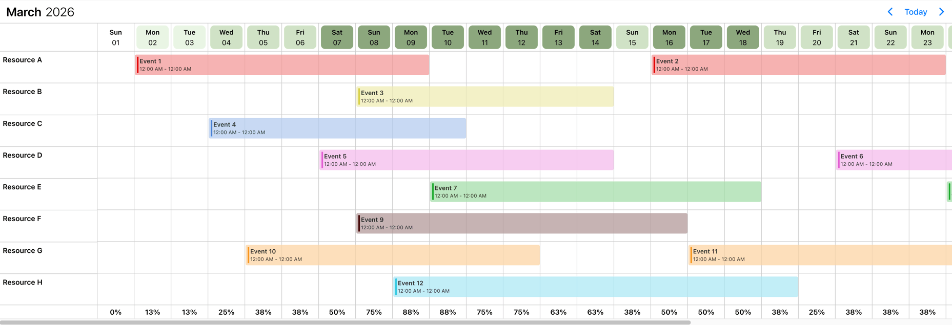
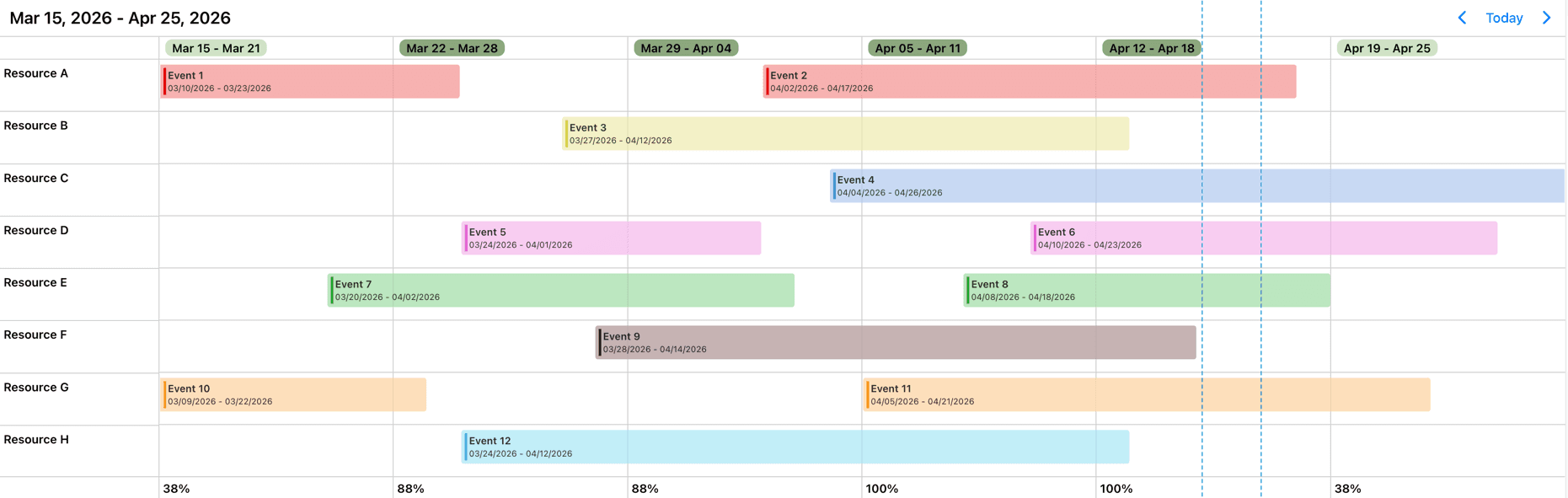
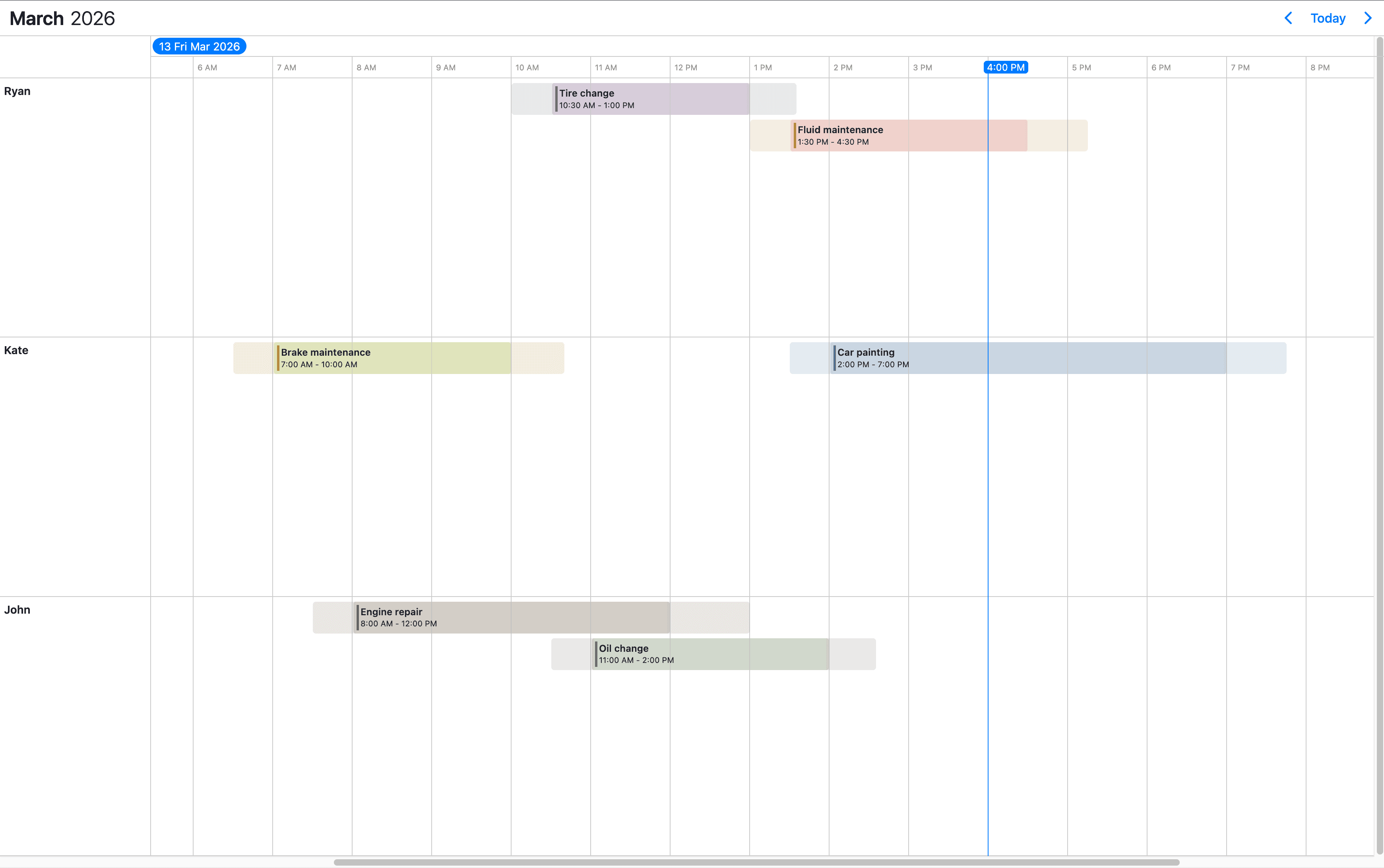
By default the Timeline rows will have variable height and will expand to accommodate the displayed events. But, this can be changed by the rowHeight property of the Timeline view option. If it is set to equal, the rows will have equal heights, and overlapping events will be distributed evenly to fit in the row.
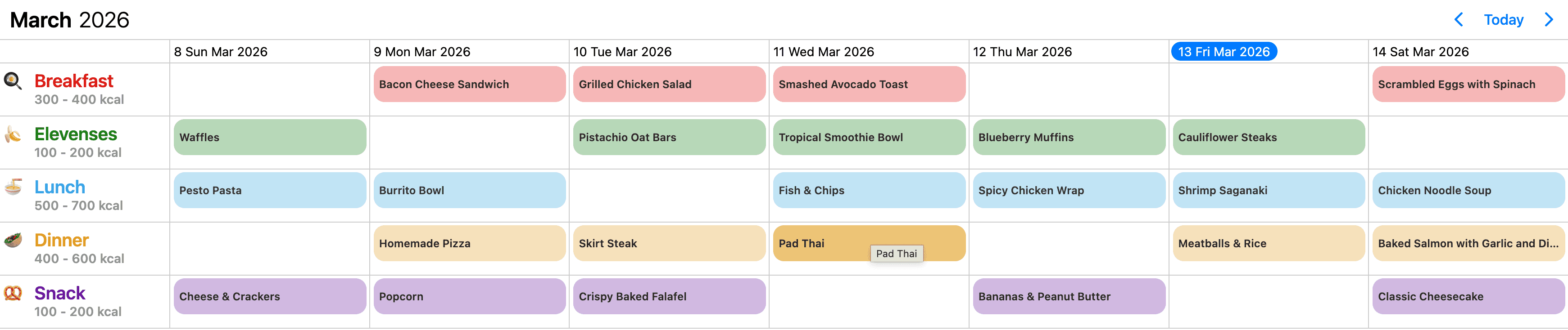
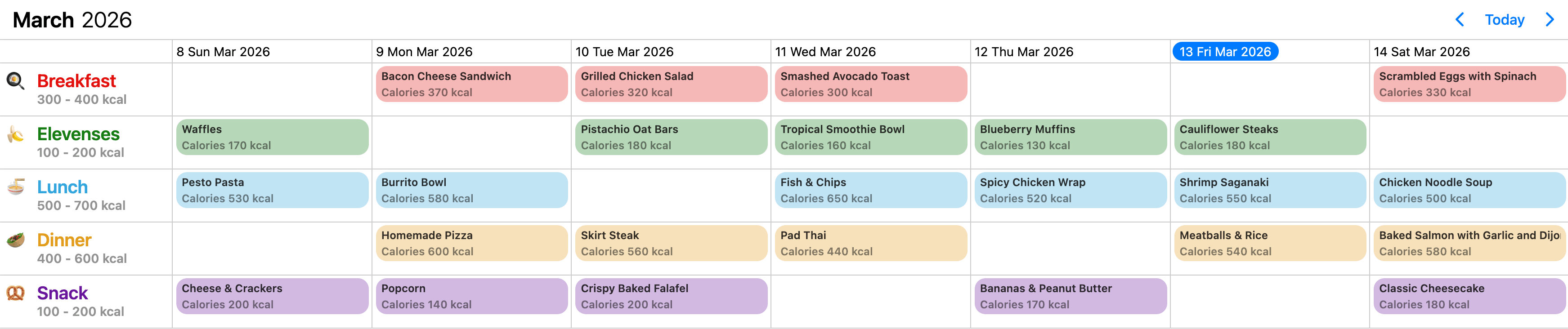
Also, the eventDisplay property transforms the event display into a daily listing mode. This view represents a daily summary rather than an hour-by-hour layout.
The capabilities like recurring events, all-day, multi-day events, responsiveness are supported by the Timeline.
Showing the Timeline
Configuring the view
The Timeline view can be configured through the view option. Below are listed the timeline object properties which can help you fine-tune this view.
import { Eventcalendar } from '@mobiscroll/react';
import '@mobiscroll/react/dist/css/mobiscroll.min.css';

function App() {
  const myViewOptions = {
    timeline: {
      maxEventStack: 2,
      eventDisplay: 'fill',
      resolutionHorizontal: 'day',
      type: 'month',
      resourceReorder: true
    }
  };

  return <Eventcalendar view={myViewOptions} />
}
columnWidth
MbscTimelineColumnWidth
Sets the width of grid columns in the timeline to one of the predefined column widths. Possible values and their corresponding widths:
xxsmall: 1.5emxsmall: 3emsmall: 4.5emmedium: 6emlarge: 7.5emxlarge: 9emxxlarge: 10.5emxxxlarge: 12em;
When not defined, the column width will be set automatically based on the view type and size.
You can customize the predefined column widths using CSS to fit your layout needs.
Default value: undefined
currentTimeIndicator
boolean
Show or hide the current time indicator.
Defaults to true, when the horizontal resolution is less than a day.
endDay
number
Specifies the last visible weekday of the view. Sunday is 0, Monday is 1, etc.
Days outside of the startDay and endDay range will not be visible.
Default value: 6
endTime
string
Set the end time of timeline days. Hours, minutes and an optional positive day offset can be specified in the same string.
- Standard format: 'HH:MM' (e.g.,
'18:30'). - Offset format (extends the view N days after - supported only for single day view): 'HH:MM+N' (e.g.,
'08:00+1').
Default value: '24:00'
eventDisplay
"fill" | "exact"
Specifies how events are displayed.
- If set to
'exact', events are displayed according to their start and end times. - If set to
'fill', events cover the entire cell.
Default value: 'exact'
eventHeight
"variable" | "equal"
Specifies wether the height of the events is equal or variable.
Default value: 'equal'
eventList (deprecated)
boolean
DEPRECATED: Use the eventDisplay property instead.
If true, transforms the layout into a summary view.
The events are listed in the appropriate cell one after the other.
Default value: false
hideEmptyRows
boolean
Hide the empty rows.
Parent resources will always be displayed, even when empty.
Default value: false.
hideInvalidRows
boolean
Hide the fully invalid rows.
Parent resources will always be displayed, even when fully invalid, unless resolutionVertical: 'day' is used.
Default value: false.
maxEventStack
number | "all"
Limit the number of displayed events. When the number of overlapping events reaches the specified value, a "more" button will be displayed which opens a popover showing the rest of the events.
- If it is a
number, it specifies how many events will be displayed before the "more" button appears. - If set to
'all', all events will be displayed.
Default value: 'all'
resolutionHorizontal
"day" | "hour" | "month" | "year" | "week" | "quarter"
Sets the horizontal resolution of the timeline.
In case of hourly resolution, the columns can be split to minutes (1, 5, 15, 20, 30) or merge to multiple
hours (2, 3, 4, 6, 8, 12) using the timeCellStep and timeLabelStep properties.
Default value: 'hour'
resolutionVertical
"day"
Sets the vertical time unit of the timeline to days. When set to 'day', the days will be rendered on the vertical axis, while the hours of the day will be displayed on the horizontal axis.
Default value: undefined
resourceReorder
boolean
Specifies whether the resource can be dragged and reordered. A drag handle icon will appear in front of the resource name, serving as the point of interaction to drag and reposition the resource.
Default value: false
rowHeight
"variable" | "equal"
Controls the height of the timeline rows.
By default rows will have variable height and will expand to accommodate the displayed events.
If it is set to 'equal', the rows will have equal heights.
Default value: 'variable'
size
number
Specifies the number of displayed years, months, weeks or days.
Default value: 1
startDay
number
Specifies the first visible weekday of the view. Sunday is 0, Monday is 1, etc.
Days outside of the startDay and endDay range will not be visible.
Should not be mistaken for the firstDay option,
which sets the first day of the week, and, if not set, is defined by the localization.
Default value: 0
startTime
string
Set the start time of timeline days. Hours, minutes and an optional negative day offset can be specified in the same string.
- Standard format: 'HH:MM' (e.g.,
'09:30'). - Offset format (initiates the view N days prior - supported only for single day view): 'HH:MM-N' (e.g.,
'20:00-1').
Default value: '00:00'
timeCellStep
number
Specifies the step of the grid cells in minutes. Supported values: 1, 5, 10, 15, 20, 30, 60, 120, 180, 240, 360, 480, 720, 1440
Default value: 60
timeLabelStep
number
Specifies the step of the time labels in minutes. Supported values: 1, 5, 10, 15, 20, 30, 60, 120, 180, 240, 360, 480, 720, 1440.
Default value: 60
type
"day" | "month" | "year" | "week"
Specifies the timeline type.
Default value: 'week'
virtualScroll
boolean
Enable or disable virtual scroll.
Default value: true
weekNumbers
boolean
Show or hide week numbers.
Default value: false
zoomLevels
{ [key:string]: MbscTimelineZoomLevel }
Defines configuration options for multiple zoom levels for the timeline view. Each zoom level can specify its own properties for displaying a custom layout.
Use the zoomLevel option to select the current zoom level.
Available properties:
sizeresolutionHorizontalresolutionVerticalcolumnWidthcurrentTimeIndicatorendDayendTimeeventListstartDaystartTimetimeCellSteptimeLabelStepweekNumberstype
Default value: undefined
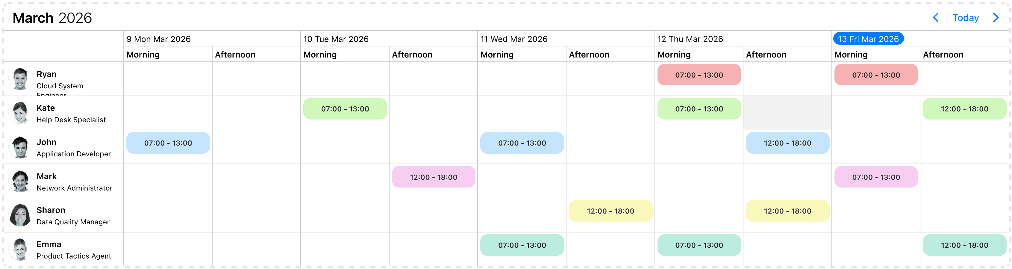
Event slots
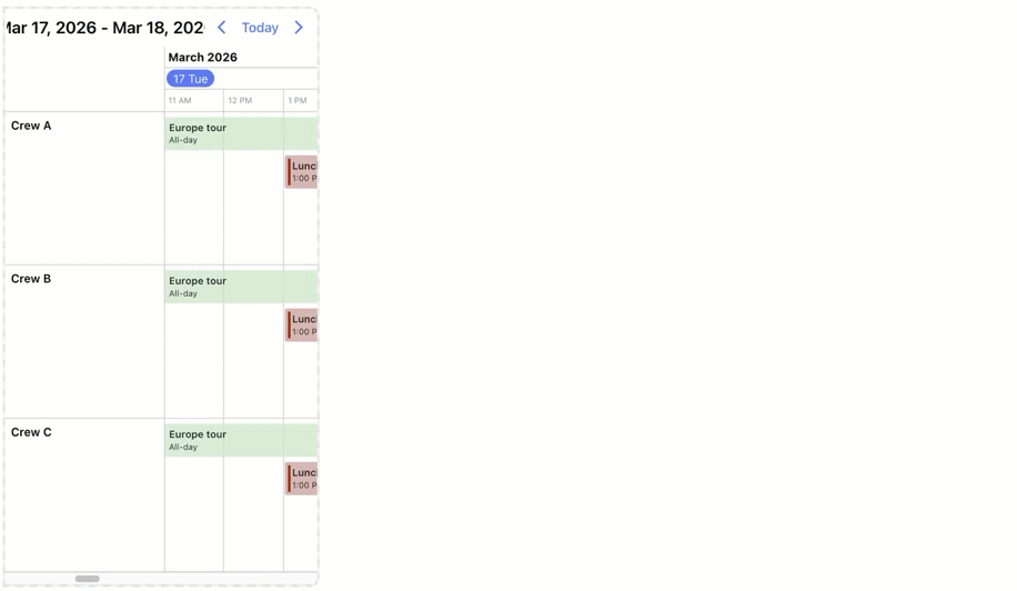
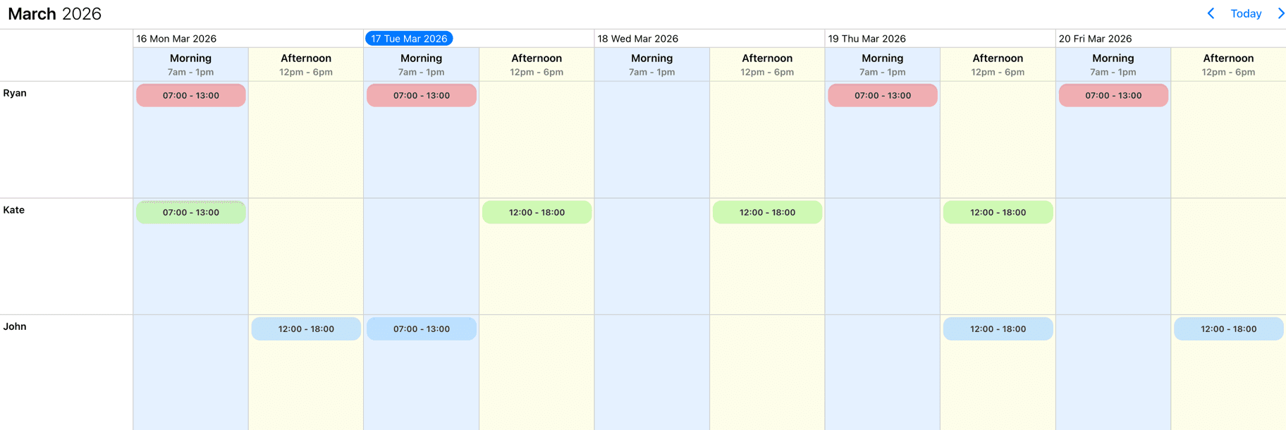
Besides the resources which are grouping data for the whole date range, slots introduce a horizontal daily grouping in case of the Timeline view. Slots can be used alongside resources.
The renderSlot function can be used to customize the slot template of the Timeline view.
When slots are used the Timeline view will display in daily listing mode and only the dragToMove event iteraction will be available. The dragToCreate and dragToResize interactions will be truned off.
import { Eventcalendar } from '@mobiscroll/react';
import '@mobiscroll/react/dist/css/mobiscroll.min.css';

function App() {
  const myShifts: [
    {
      id: 1,
      name: "Morning shift",
    },
    {
      id: 2,
      name: "Afternoon shift",
    },
  ];

  return <Eventcalendar slots={myShifts} />
}
Column width
The columnWidth option in the timeline view allows you to control the width of the timeline columns. It supports the following predefined sizes: xxsmall, xsmall, small, medium, large, xlarge, xxlarge, and xxxlarge.
Here are the default sizes and their corresponding widths:
.mbsc-timeline-column-xxs {
  width: 1.5em; // 24px
}

.mbsc-timeline-column-xs {
  width: 3em; // 48px
}

.mbsc-timeline-column-s {
  width: 4.5em; // 72px
}

.mbsc-timeline-column-m {
  width: 6em; // 96px
}

.mbsc-timeline-column-l {
  width: 7.5em; // 120px
}

.mbsc-timeline-column-xl {
  width: 9em; // 144px
}

.mbsc-timeline-column-xxl {
  width: 10.5em; // 168px
}

.mbsc-timeline-column-xxxl {
  width: 12em; // 192px
}
To specify the columnWidth in your view configuration, include it as part of the timeline view options:
view: {
  timeline: {
    columnWidth: 'large'
  }
}
The predefined sizes correspond to specific default widths, but you can override them using CSS:
.mbsc-timeline-column-l {
  width: 50px;
}
You need to apply these rules after the mobiscroll default rules, otherwise the default rules will take precedence over them.
Shifted days
Shifted views can be implemented by extending the daily timeline view with hours from the previous or next calendar days using the startTime and endTime properties with a day-offset format.
Shift Start Time (Previous Day Offset)
Use a negative day offset (HH:MM-D) to show hours from the previous day (e.g., '20:00-1').
Shift End Time (Next Day Offset)
Use a positive day offset (HH:MM+D) to extend the view into the next day (e.g., '06:00+1').
view: {
  timeline: {
      type: 'day',
      resolutionHorizontal: 'hour',
      resolutionVertical: 'day',
      // Starts the view at 20:00 on the previous day
      startTime: '20:00-1',
      // Ends the view at 06:00 on the next day
      endTime: '06:00+1'
  }
}
The day-offset feature is strictly dependent on the type: 'day' and the default hourly resolutionHorizontal setting. This can be efficiently combined with resolutionVertical: 'day' of any size.
Resources
Resource grouping and hierarchy
The Timeline view supports resource hierarchy. Hierarchy groups can be defined with the children property of the resource object. Child objects are also resources and have the same properties, thus they can also have children.
import { Eventcalendar } from '@mobiscroll/react';
import '@mobiscroll/react/dist/css/mobiscroll.min.css';

function App() {
  const myResources = [{
    name: 'Site 1',
    children: [{
      name: 'Building 1'
      children: [{
        name: 'Room 1'
      }, {
        name: 'Room 2'
      }]
    }, {
        name: 'Building 2'
    }]
  }, {
    name: 'Site 2',
    children: [{
      name: 'Building A'
    }]
  }];

  return <Eventcalendar resources={myResources} />
}
By default every resource group will be displayed and this can be modified with the collapsed attribute of the parent objects.
import { Eventcalendar } from '@mobiscroll/react';
import '@mobiscroll/react/dist/css/mobiscroll.min.css';

function App() {
  const myResources = [{
    name: 'Main Building',
    id: 'main',
    description: 'Used the most for scheduling'
    collapsed: true,
    children: [{
      name: 'Big conf. room'
      id: 'bfg',
    }, {
      name: 'Smaller conf. room'
      id: 'sfg',
    }]
  }, {
    name: 'Secondary Building',
    id: 'sec',
    description: 'For smaller, less important meetings'
    collapsed: false,
    children: [...]
  }, {
    name: 'Long forgotten Cave',
    id: 'cave',
    description: 'Where developers used to work'
    collapsed: false,
  }];

  return <Eventcalendar resources={myResources} />
}
Both parent and child rows can contain events and events can be moved between any rows.
import { Eventcalendar } from '@mobiscroll/react';
import '@mobiscroll/react/dist/css/mobiscroll.min.css';

function App() {
  const myResources = [{
    name: 'Main Building',
    id: 'main',
    children: [{
      name: 'Big conf. room'
      id: 'bfg',
    }]
  }, {
    name: 'Secondary Building',
    id: 'sec',
  }];
  const myEvents: [
    { title: 'Open day celebration', resource: 'main', date: '2023-08-24'},
    { title: 'Monthly staff meeting', resource: 'bfg', start: '2023-08-01T11:00', end: '2023-08-01T11:00' },
    { title: 'Weekly chit-chat', resource: 'sec', start: '2023-08-02T09:00', end: '2023-08-02T09:40' },
    ...
  ];

  return <Eventcalendar resources={myResources} data={myEvents} />
}
Child or parent rows can be disabled by creating an invalid rule which repeats daily and it is tied to the specific resources. Example:
import { Eventcalendar } from '@mobiscroll/react';
import '@mobiscroll/react/dist/css/mobiscroll.min.css';

function App() {
  const myInvalid = [
    {
      recurring: { repeat: "daily" },
      resource: [
        /* resource id(s) */
      ],
    },
  ];

  return <Eventcalendar invalid={myInvalid} />
}
Resource order
The initial order in which the resources appear on the timeline follows the order of the array passed to the component. If the initial order needs to be changed, sort the resource array before passing it to the event calendar.
For dynamic sorting during runtime, sort the resource array and pass the updated array to the calendar.
Resources can be reordered directly through the UI by enabling the resourceReorder option in the view configuration. When enabled, a drag handle icon will appear before each resource, serving as the point of interaction to drag and reposition the resource.
After a resource is dragged and dropped to a new position, the onResourceOrderUpdate lifecycle event is triggered. To make specific resources non-draggable, set the reorder property of the corresponding resource object to false;
Resource external drag and drop
You can drag and drop resources into or out of the timeline view, allowing for easy organization and adjustments.
Targeting the timeline
To allow external resources to be dragged into your timeline, first set the the externalResourceDrop option to true. As a second step, you'll need to create your external draggable element and pass a skeleton resource definition through the dragData option. Make sure to also set type="resource" on the draggable element so the timeline correctly identifies it as a resource.
The timeline as a source
Resources can be dragged out of the timeline and dropped onto another instance of the Timeline or any Dropcontainer. To enable this behavior, you'll need to set the externalResourceDrag option to true.
When a resource is dragged out of the timeline, the onResourceDragLeave lifecycle event is triggered. A visual clone of the resource is shown to indicate the movement. If the resource is dropped into an external drop container or another timeline, it gets removed from the original timeline. This action also triggers the onResourceDelete and onResourceDeleted lifecycle events.
When a resource is dragged into the timeline, the onResourceDragEnter lifecycle event is triggered. If the resource is dropped, the onResourceCreate and onResourceCreated events will be fired, finalizing the addition.
Resource column width
The width of the resources column on the Timeline view is fixed. It can be overwritten from CSS using the following rule:
.mbsc-timeline-resource-col {
  width: 200px;
}
The width of the resource column adjusts as resources are expanded or collapsed. The default increment step can be modified with a CSS rule:
.mbsc-timeline-resource-depth-step {
  width: 20px;
}
If the step adjustment is not needed, it can disabled by setting the value to width: 0;.
Resource row height
There are three CSS classes which can be used for changing the height of resource rows:
-
For setting the resource row heights in general, you can use the
.mbsc-timeline-rowclass..mbsc-timeline-row {height: 80px;} -
For setting the height of the parent resources, you can use the
.mbsc-timeline-parentclass..mbsc-timeline-parent {height: 30px;}infoThere's minimum height of the rows which can only be decreased if the event creation is disabled on the relevant resource. You can prevent event creation by using the
eventCreationproperty of the theresourcesoption. -
For customizing the remaining empty space below the events, you can use the
.mbsc-timeline-row-gutterclass..mbsc-timeline-row-gutter {height: 6px;}
Hide empty resources
Rows without any events can be hidden by setting hideEmptyRows to true under the view configuration.
Parent resources will always be displayed, even when empty.
If resolutionVertical is set to 'day' and all resources for a given day are empty, the entire day will be hidden.
Hide invalid resources
Fully invalid rows can be hidden by setting hideInvalidRows to true under the view configuration.
A resource row is considered fully invalid if it contains invalid periods defined with allDay, date values,
or a single time range that covers a full day or multiple days.
Parent resources will always be displayed, even when fully invalid.
If resolutionVertical is set to 'day' and all resources for a given day are fully invalid, the entire day will be hidden.
Virtual scroll
Virtual scroll is a performance optimization that ensures smooth scrolling and fast rendering when displaying large numbers of events or resources in the timeline.
The timeline view is virtualized, meaning its markup is dynamically generated and managed as needed. As you scroll vertically or horizontally, the component updates what's visible in real time, only rendering the elements that appear in the viewport. This approach dramatically improves performance for large datasets: events and resources are not all loaded into memory at once, keeping the interface fast and responsive.
When virtual scroll is enabled, the timeline calculates which items should be displayed based on the current scroll position.
Only the visible portion of the view is rendered, while non-visible parts are skipped until they come into view.
Scrolling triggers the onVirtualLoading lifecycle event, which can be used to load data incrementally during scrolling, instead of fetching everything upfront.
You can see an example of this pattern in the Load resources on scroll demo.
The calendar needs to be to placed inside a container which has a height. This can be either a fixed height, a height in percentage, or a flex height. When the calendar is placed directly in a container with a fixed height, it will work out of the box. If the height of the container is specified in percentage, e.g. you'd like to fill the full page height, you need to make sure that all parent elements also have height: 100% specified, up until the body and html elements, or until the closest parent which has a fixed height. If the container is inside a parent with flex layout, it will also work out of the box.
In some cases, you may want to disable virtual scroll, for example:
- When working with a small dataset that doesn't benefit from virtualization.
- When you need to access or manipulate all DOM elements at once.
To disable it, set virtualScroll to false.
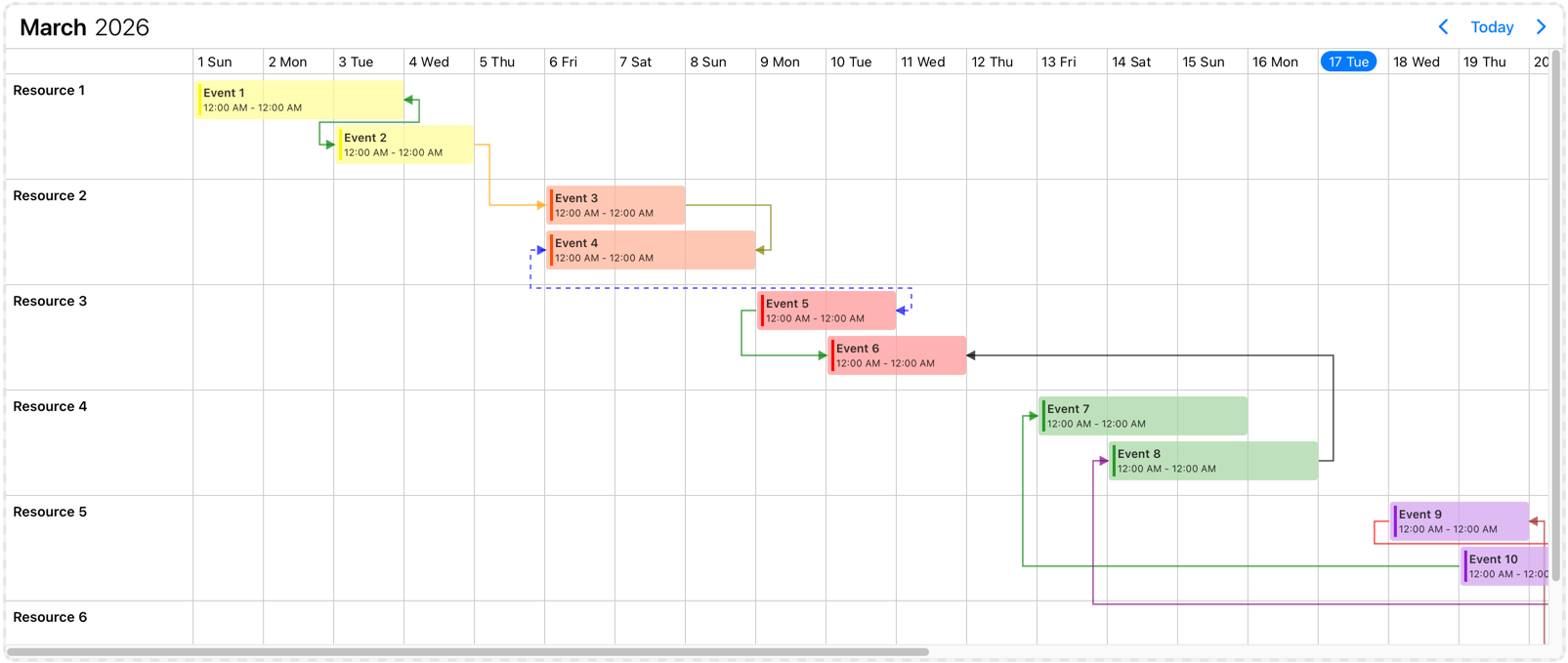
Event connections
The Timeline view can display connections between events. Events will be linked with lines and additionally arrows can be displayed to illustrate the direction of the connection. Events can have multiple connections simultaneously. Connections can be specified with the connections option.
Event order
The rendered event order is determined by the following two concepts:
- Event data order
- Event layout
The combination of these concepts results in the final rendered event order.
Event data order
The sequence in which events are processed before being passed to the layout algorithm. The default ordering rules are as follows:
- All-day events are placed at the top.
- Non-all-day events follow, sorted by their start times.
- Events with the same start time are further ordered alphabetically by their titles.
This default order can be modified using the order property in the event event data. The order property takes precedence over the default rules. If two events have the same order value, the default rules apply. For more complex ordering requirements, the eventOrder option can be used. This option accepts a function that compares two events and returns an order (-1 or 1).
Event layout
The event layout process determines the visual positioning and dimensions of events. This is a built-in functionality and cannot be altered externally. The layout algorithm processes the sorted event list and calculates each event's position and size. The algorithm follows these steps:
- The first event is placed in the first position of the event track.
- If two or more events overlap in their start/end times, the later event is placed in the next event track, positioned below to the previous event.
- If a subsequent event does not overlap with any already added events, it is placed back in the first event track.
- This process continues until all events are positioned within their respective rows.
Responsiveness
The Timeline is fully responsive. It adapts to the available space and fills the screen to look good everywhere. While you don't have to worry about the width the height can be manually adjusted with the height option. This specifies different options for different container widths, in a form of an object, where the keys are the name of the breakpoints, and the values are objects containing the options for the given breakpoint.
Use the responsive option to configure how the calendar behaves on different sized screens. The responsive option is equipped with five breakpoints:
xsmall(up to 575px),small(up to 767px),medium(up to 991px),large(up to 1199px),xlarge(from 1200px).
Also, custom breakpoints can be added if necessary:
my-custom-breakpoint: { breakpoint: 600 }(from 600px up to the next breakpoint).
The available width is queried from the container element of the component and not the browsers viewport like in css media queries.
import { Eventcalendar } from '@mobiscroll/react';
import '@mobiscroll/react/dist/css/mobiscroll.min.css';

function App() {
  const myResponsive = {
    xsmall: {
      view: { timeline: { type: 'day', size: 2 }}
    },
     medium: {
      view: {
        timeline: { type: 'week' }
      }
    },
    custom: { // Custom breakpoint, you can use multiple if needed, but each must have a unique name.
      breakpoint: 1000,
      view: { timeline: { type: 'month' }}
    }
  };

  return <Eventcalendar responsive={myResponsive} />
}
Zoom Levels
The timeline view allows you to define and use multiple zoom levels, making it easy to switch between different time scales. You can select a specific zoom level to focus on the desired level of detail.
Configuring Zoom Levels
Zoom levels are set up in the zoomLevels property of the timeline view. Each zoom level can have its own options for customizing the timeline's layout and behavior. You can specify a zoom level using number or string-based keys, and the corresponding view options will be applied.
Available options
- type
- size
- resolutionHorizontal
- resolutionVertical
- columnWidth
- currentTimeIndicator
- startDay - endDay
- startTime - endTime
- timeCellStep
- timeLabelStep
- weekNumbers
Example Configuration
view: {
  timeline: {
    zoomLevels: {
      -4: { type: 'year', size: 6, resolutionHorizontal: 'year' },
      -3: { type: 'month', size: 6, resolutionHorizontal: 'month' },
      -2: { type: 'week', size: 5, resolutionHorizontal: 'week' },
      -1: { type: 'week', size: 5, resolutionHorizontal: 'day' },
      0: { type: 'week', size: 5, resolutionHorizontal: 'day', columnWidth: 'large' },
      1: { type: 'week', size: 5, resolutionHorizontal: 'day', columnWidth: 'xlarge' },
      2: { type: 'day', size: 3, resolutionHorizontal: 'hour', timeCellStep: 360, timeLabelStep: 360 },
      3: { type: 'day', size: 3, resolutionHorizontal: 'hour', timeCellStep: 180, timeLabelStep: 360 },
      4: { type: 'day', size: 3, resolutionHorizontal: 'hour', timeCellStep: 30, timeLabelStep: 60 },
    }
  }
},
zoomLevel: 0
Setting the Active Zoom Level
The zoomLevel option determines which zoom level is currently active. When set, the timeline automatically applies the corresponding settings from zoomLevels.
To ensure the calendar view is correctly aligned when zooming, the getViewDate() method is used to retrieve the current middle date of the visible calendar view. Based on the zoom level, the refDate is set to a corresponding date, ensuring that the view date can always be scrolled to the center.
Learn how to implement and adjust zoom levels by checking this example.
Templating
The display of Timeline can be customized with different render functions.
The cell
Use the renderCell option to fully customize the Timeline cells. Customize how the cell look and what they show. The renderer function gets an object with properties like date, events, colors, invalids, resource, and slot which can be used to display custom content.
Since cells are rendered frequently while scrolling, keep the customization lightweight for best performance.
Check out how you can style the cell in this example or just play with the slider below to see the differences.
The resource, their header and footer
There are three approaches you can take:
- Use the renderResource option to customize the resource template of the Timeline. Customize how the resource headers look and what they show. Utilize properties passed in the resources array. It takes a function that should return the desired markup. In the returned markup, you can use custom html as well.
- Customize the empty cell content above the resource column with the renderResourceHeader option. It takes a function that should return the desired markup. In the returned markup, you can use custom html as well.
- Or if you want to customize the empty cell content below the resource column you can achieve this with the renderResourceFooter option. It takes a function that should return the desired markup. In the returned markup, you can use custom html as well. This element only renders for the Timeline view, if the renderDayFooter option is present.
Check out how you can style these resource parts in this example or just play with the slider below to see the differences.
The sidebar, their header and footer
Besides the resource template, an additional sidebar can be rendered on the opposite end of the row and there are three approaches you can take:
- Use the renderSidebar option to render a custom sidebar on the right side of the Timeline. It takes a function that should return the desired markup. In the returned markup, you can use custom html as well. The template will receive the resource object as data. This data can be used to show resource specific things on the sidebar.
- Customize the empty cell content above the sidebar column with the renderSidebarHeader option. It takes a function that should return the desired markup. In the returned markup, you can use custom html as well. This element only renders for the Timeline view, if the renderSidebar option is present.
- Or if you want to customize the empty cell content below the sidebar column you can achieve this with the renderSidebarFooter option. It takes a function that should return the desired markup. In the returned markup, you can use custom html as well. This element only renders for the Timeline view, if the renderSidebar option is present.
Check out how you can style the sidebar parts in this example or just play with the slider below to see the differences.

The date header and footer
The headers hold key information like the date, day of the week and in some cases it also holds the full date. Whenever you need to show extra information, or if you would like to change the styling or date format, time format you can use the various header templates, depending on the view configuration. You can also show a footer element, for displaying more information.
Depending on the resolution, the first Timeline row under the navigation header can show a line for each of the following:
Hourly header/footer template
With an hourly (or sub-hourly) resolution the renderHour and renderHourFooter options can be used for customizing the header and footer.
Daily header/footer template
With a daily resolution, the renderTimelineDay and renderDayFooter options can come in handy for customizing the header and footer.
Weekly header/footer template
When the resolution is weekly, the renderWeek and renderWeekFooter options can be used.
Monthly header/footer template
When displaying multiple months, the renderMonth and renderMonthFooter options can be used for customizing the header and footer per month.
Quarter header/footer template
When displaying multiple quarters, the renderQuarter and renderQuarterFooter options can be used for customizing the header and footer per quarter.
Yearly header/footer template
With a yearly resolution, the renderYear and renderYearFooter options can be used for customizing the header and footer.
Check out how you can style the date header and footer in this example or just play with the sliders above to see the differences.
The event and buffer areas
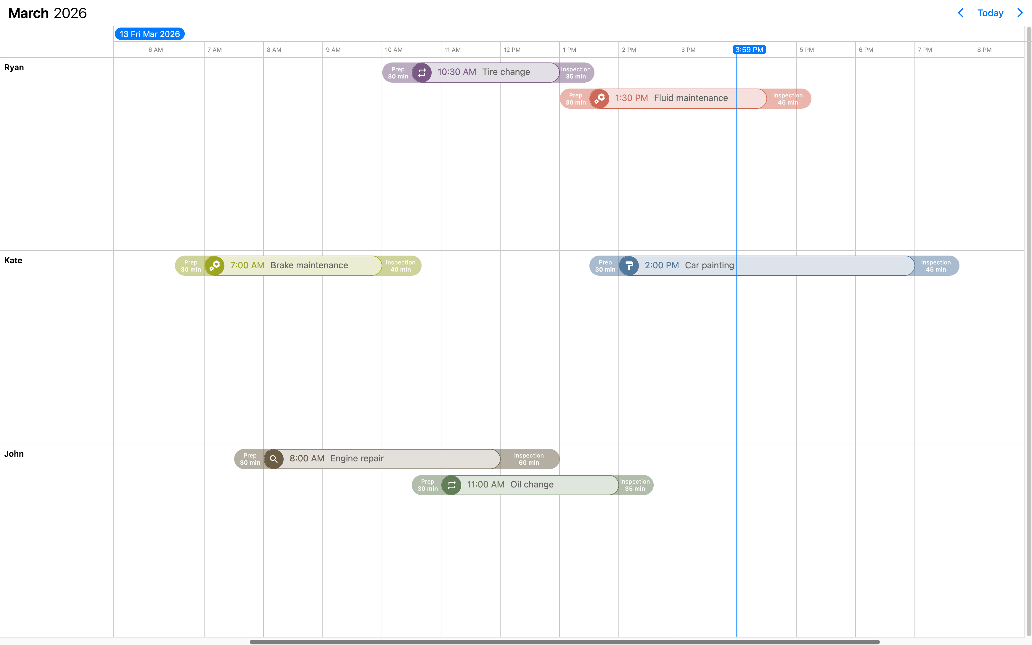
You can use the renderTimelineEvent option to customize the events that appear on the scheduler. It should return the markup of the event. The Eventcalendar will take care of the positioning, but anything else you want to show is up to you - like a title, description, color the background or show any content.
The buffers can be customized through the renderBufferBefore and renderBufferAfter options. These can help you visualise delays or added minutes for tasks. For example travel time for meetings/appointments, check in/check out for flights.
Check out how you can style the events and the buffer areas in this example or just play with the slider below to see the differences.
The event content
If you are looking to customize only the content and don't want to bother with the styling of the event, you can use the renderTimelineEventContent option. Mobiscroll will position the event to the right place and will render essential information like the color of the event, the time and if it's an all day event or not. The title, description and any other fields you want to show (like participants or an avatar) will be coming from your custom function.
Check out how you can style the event content in this example or just play with the slider below to see the differences.
The event slots��
Use the renderSlot option to customize the slot template of the Timeline view. Customize how the time slots look and what they show. Utilize properties passed in the slots array. It takes a function that should return the desired markup. In the returned markup, you can use custom html as well.
Check out how you can style the slots in this example or just play with the slider below to see the differences.

The timeline header
Customize how the header of the Timeline looks and how the components are arranged with the renderHeader option. It takes a function that should return the desired markup. In the returned markup, you can use custom html as well as the built in header components of the calendar.
While fully customizing the header is very usefull, sometimes it's desireable to customize only parts of it. In this case you can take advantage of the default header's building blocks. These components let you put toghether the header you want, while you don't have to worry about the functionality behind them.
Check out how you can style the Timeline header in this example or just play with the slider below to see the differences.
Variable event height
When using event templating, you might end up with various event heights, depending on the displayed content, e.g. larger description, list of tasks, etc. By default this might not show up correctly, resulting in events overlapping each other.
You can enable support for variable event heights by setting the eventHeight: 'variable' property for the timeline inside the view option.
This will enable a new rendering mode. In case of large views, where virtual scrolling is used, the height of the rows might change dynamically
as new events are loaded into the view during scroll.
API
Here is a comprehensive list of all the specific options, events and methods of the Timeline view.
Options
Explore the following API options that help you easily configure the Timeline.
clickToCreate
boolean | "double" | "single"
Enable new event creation on click. If true or 'double', a new event will be created only with a double click
and with the 'single' value the event will be created instantly with a single click.
This option will only work on desktop environment where mouse events are fired. It will also allow deleting of the focused events using the Delete or Backspace key.
In touch environment a long tap should be used to create a new event and it is controlled by the dragToCreate option.
Using the extendDefaultEvent option extra properties can be set for the created event.
The event deletion functionality can be overwritten using the eventDelete option.
Default value: undefined
colors
Array<MbscCalendarColor>
Specifies the color for certain dates or date ranges on the calendar.
The MbscCalendarColor type has the following properties:
allDay: boolean - Specifies whether the date you want to color is all day or not.background: string - Background color of the cell. It can be any valid CSS color ('red','#ff0000','rgb(255, 0, 0)', etc.).cellCssClass: string - CSS class for the day cell. Only applicable for the calendar view.cssClass: string - Specifies a custom CSS class for the color. Useful when customization is needed for the background of cells and time ranges. Only applicable for the timeline and scheduler views.date: string | object | Date - Specifies a single date for the colorend: string | object | Date - Specifies the end date/time of a date/time range for the colorhighlight: string - Highlight color of the day, can be any valid CSS color ('red','#ff0000','rgb(255, 0, 0)', etc.).recurring: string | MbscRecurrenceRule - Specifies a recurrence rule for handling recurring days.recurringException: string | object | Date | Array<string | object | Date> - Exception dates of the recurring rule. Useful when specific dates need to be skipped from the rule.recurringExceptionRule: string | MbscRecurrenceRule - Exception rule of the recurring rule. Useful when recurring dates need to be skipped from the rule.resource: string | number | Array<string | number> - In case of the timeline and scheduler view of the Eventcalendar, specifies the resource ids for the color. The color will be displayed only on the specified resource. If there is no resource defined, it will be applied to every resource.slot: string | number - In case of the timeline view of the Eventcalendar, specifies the slot id for the color. The color will be displayed only on the specified slot. If there is no slot defined, it will be applied to every slot.start: string | object | Date - Specifies the start date/time of a date/time range for the colortextColor: string - A color applied on the text.title: string - A title that will be displayed on the item.
The colored range will be considered all-day if:
- the
allDayproperty is explicitly set. - the
start/endproperties are not specified, only thedate.
The dates can be specified as JavaScript Date objects, ISO 8601 strings, or moment objects.
For Javascript Date objects the month numbers are zero based. Like: 0 - January, 1 - February ... 11 - December.
[
  { date: new Date(2020, 2, 23), background: 'pink' },
  { date: new Date(2020, 2, 24), background: 'green' },
  { background: '#ff0000', recurring: { repeat: 'weekly', weekDays: 'SU' } },
  { background: 'yellow', recurring: { repeat: 'weekly', weekDays: 'SA' } }
]
Default value: undefined
connections
Array<MbscEventConnection>
Specifies connections between events. On the UI events will be linked with lines and additionally arrows can be displayed to illustrate the direction of the connection. Events can have multiple connections simultaneously.
An array of connection objects can be passed.
The MbscEventConnection type has the following properties:
arrow: boolean | "from" | "to" | "bidirectional" - Specifies where to display arrows Iftrue, the arrow will display only at the end side of the connection.color: string - Specifies the color of the connection.cssClass: string - Custom CSS class for the connection line for further customization.from: string | number - The id of the event where the connection will beginto: string | number - The id of the event where the connection will end.type: "fs" | "sf" | "ss" | "ff" - The type of the connection. Possible values:'fs'- finish-to-start,'sf'- start-to-finish,'ss'- start-to-start,'ff'- finish-to-finish.
Default value: undefined
context
string | HTMLElement
The DOM element in which the popups (event popover, year and month picker) are rendered. Can be a selector string or a DOM element.
Default value: 'body'
cssClass
string
Specifies a custom CSS class for the component.
Default value: undefined
data
Array<MbscCalendarEvent>
The events for the Eventcalendar.
The MbscCalendarEvent type has the following properties:
allDay: boolean - Specifies if the event is all day or not.bufferAfter: number - Defines a buffer time in minutes that will be displayed after the end of the event.bufferBefore: number - Defines a buffer time in minutes that will be displayed before the start of the event.cellCssClass: string - CSS class for the day cell. Only applicable for the calendar view.color: string - Background color of the eventcssClass: string - Specifies a custom CSS class that is applied to the event. Useful when customization is needed on the event level. For example: setting the width for specific events.date: string | object | Date - Specifies a single date for the eventdragBetweenResources: boolean - Specifies whether the event is movable across resources.dragBetweenSlots: boolean - Specifies whether the event is movable across across slots.dragInTime: boolean - Specifies whether the event is movable in time.editable: boolean - Specifies if an event is editable or not. If false, drag & drop and resize is not allowed.end: string | object | Date - Specifies the end date/time of a date/time range for the eventid: string | number - A unique id for the event. If not specified, the event will get a generated id.order: number - Specifies the order of the event in the array. Has precedence over the default ordering rules.overlap: boolean - Specifies whether the event can be overlapped. Has precedence over theeventOverlapproperty of the resource and the eventOverlap option.recurring: string | MbscRecurrenceRule - Specifies a recurrence rule for handling recurring events.recurringException: string | object | Date | Array<string | object | Date> - Exception dates of the recurring rule. Useful when specific dates need to be skipped from the rule.recurringExceptionRule: string | MbscRecurrenceRule - Exception rule of the recurring rule. Useful when recurring dates need to be skipped from the rule.resize: boolean - Specifies whether the event is resizable. Has precedence over theeventResizeproperty of the resource and the dragToResize option.resource: string | number | Array<string | number> - In case of the timeline and scheduler view of the Eventcalendar, specifies the resource ids for the event. The event will be displayed only on the specified resource. If there is no resource defined, it will be displayed on every resource.slot: string | number - In case of the timeline view of the Eventcalendar, specifies the slot id for the event. The event will be displayed only on the specified slot. If there is no slot defined, it will be displayed on every slot.start: string | object | Date - Specifies the start date/time of a date/time range for the eventtextColor: string - A color applied on the text.timezone: string - Timezone of the eventtitle: string - The title of the event.tooltip: string - The tooltip text of the event.
The dates can be specified as JavaScript Date objects, ISO 8601 strings, or moment objects.
For Javascript Date objects the month numbers are zero based. Like: 0 - January, 1 - February ... 11 - December.
The event objects may have additional custom properties as well. The custom properties are not used by the event calendar, but they are kept and will be available anywhere the event objects are used. E.g. the onEventClick event will receive the event object as argument, containing the custom properties as well.
Use the getEvents method to get the events between two dates.
data: [
  {
    start: new Date(2021, 5, 23),
    end: new Date(2021, 5, 30),
    title: 'Conference',
    allDay: true,
    color: 'red'
  },
  {
    title: 'Work project',
    recurring: {
      repeat: 'daily',
      until: '2021-04-01'
    },
    recurringException: ['2021-03-15', '2021-03-25'],
    recurringExceptionRule: {
      repeat: 'weekly',
      weekDays: 'SA,SU'
    }
  }
]
Default value: undefined
dataTimezone
string
The timezone in which the data is interpreted. If the data contains timezone information
(when the ISO string has a timezone offset, e.g. "2021-03-28T01:00:00Z" or "2021-03-28T03:00:00+03:00")
then the data's timezone is used instead.
When using timezones, the exclusiveEndDates option is also turned on by default.
When using anything other than the default ('local'), a timezone plugin
must be also passed to the component.
Possible values:
'local'- The system's local timezone.'utc'- UTC (Universal Coordinated Time) timezone.- Timezone name - The timezone name from the
IANA time zone database, e.g.
"America/New_York".
If not specified, it defaults to the displayTimezone.
Default value: undefined
defaultSelectedDate
Specifies the initial selected date on the calendar.
For views, where time is also displayed, the view will be scrolled to the specified time. If the time part is not explicitly specified, it defaults to the start of the day.
Default value: undefined
displayTimezone
string
The timezone in which the data is displayed.
When using timezones, the exclusiveEndDates option is also turned on by default.
When using anything other than the default ('local'), a timezone plugin
must be also passed to the component.
Possible values:
'local'- The system's local timezone.'utc'- UTC (Universal Coordinated Time) timezone.- Timezone name - The timezone name from the
IANA time zone database, e.g.
"America/New_York".
Default value: 'local'
dragBetweenResources
boolean
If false, the events will not be moveable across resources, only in time.
To control movement in time, use the dragInTime option.
Consider that dragToMove has to be enabled.
Default value: true
dragBetweenSlots
boolean
If false, the events will not be moveable across slots, only in time and resource.
To control movement in time, use the dragInTime option.
Consider that dragToMove has to be enabled.
Default value: true
dragInTime
boolean
If false, the events will not be moveable in time.
In case of the scheduler and timeline views events events can still be moved between resources.
To control movement between resources, use the dragBetweenResources option.
Consider that dragToMove has to be enabled.
Default value: true
dragTimeStep
number
Specifies the steps in minutes for the scheduler and timeline events during drag.
Default value: 15
dragTimeStepBase
"viewStart" | "dayStart"
Specifies the base of the dragTimeStep calculation.
If set to 'viewStart' it takes the startTime property of the view option as reference.
Default value: 'dayStart'
dragToCreate
boolean
If true, dragging on an empty cell will create a new event.
It will also allow deleting of the focused events using the Delete or Backspace key.
The title of the new event can be specified with the newEventText option.
Using the extendDefaultEvent option extra properties can be set for the created event.
The event deletion functionality can be overwritten using the eventDelete option.
Default value: undefined
dragToMove
boolean
If true, the events will be moveable.
Default value: undefined
dragToResize
boolean
If true, the events will be resizable.
Default value: undefined
eventDelete
boolean
Enables or disables event deletion. When true, the focused event will be deleted on pressing the Delete or Backspace
keys on the keyboard.
By default the event deletion depends on the clickToCreate and dragToCreate options.
If either of those are true, and no eventDelete option is set, then event deletion is also enabled, otherwise not.
Default value: undefined
eventOrder
(event1: MbscCalendarEvent, event2: MbscCalendarEvent) => number
Determines the ordering of the events within the same day. Can be a function that accepts two event objects as arguments and should return -1 or 1.
If not specified, the default order is:
- all day events
- rest of events, sorted by start time; events with identical start times, will be ordered alphabetically based on their title
Default value: undefined
eventOverlap
boolean
If false, the events cannot overlap.
Default value: true
exclusiveEndDates
boolean
If true, the Eventcalendar will work in exclusive end dates mode,
meaning that the last moment of the range (event, invalid, colors, etc.) is not part of the range.
E.g. end: '2021-07-03T00:00' means that the event ends on 2nd of July and will not be displayed on 3rd of July.
When using timezones, the exclusiveEndDates option will default to true.
extendDefaultEvent
(args: MbscNewEventData) => void | MbscCalendarEvent
Use this option to set properties to the new event created with click or drag. The event creation is handled by the clickToCreate and dragToCreate options. It takes a function that should return the properties for the new event. The argument object passed to this function has the following properties:
start: Date - The date when the newly created event will start.resource: string | number - The id of the resource where the event creation started.
extendDefaultEvent: (args) => {
  return {
    color: args.resource === 'admin' ? 'green' : 'red',
    title: 'My event',
  };
}
Default value: undefined
externalDrag
boolean
If true, external drag & drop is allowed and events can be dragged outside of the component view.
Default value: undefined
externalDrop
boolean
If true, external events can be dragged into the view.
Default value: undefined
externalResourceDrag
boolean
If true, external drag & drop is allowed and resource can be dragged outside of the component view.
Default value: undefined
externalResourceDrop
boolean
If true, external resources can be dragged into the view.
Default value: undefined
height
string | number
Sets the height of the component.
The height of the calendar view impacts the number of labels that fit into a table cell. A "show more" label will be displayed for events that don't fit.
Default value: undefined
immutableData
boolean
If true, the Eventcalendar will work in immutable mode.
In this mode the component won't update the data directly,
only fire the necessary lifecycle events, where the original data can be updated manually.
Default value: undefined
invalid
Array<MbscDateType> | Array<MbscCalendarInvalid>
An array containing the invalid values. Can contain dates, or objects with the following properties:
allDay: boolean - Specifies whether the invalid range is all day or not.start: Date | string | object - Start of the invalid range.end: Date, string | object - End of the invalid range.recurring: string | object - Recurrence rule for recurring invalid ranges.recurringException: string | object | Array<string | object> - Exception dates of the recurring rule. Useful when specific dates need to be skipped from the rule.recurringExceptionRule: string | object - Exception rule of the recurring rule. Useful when recurring dates need to be skipped from the rule.resource: string | number | Array<string | number> - Specifies the resource ids for the invalid range. The invalid range will be displayed only in the specified resource. If there is no resource defined, the invalid range will be displayed in every resource.slot: string | number - Specifies the slot id for the invalid range. The invalid range will be displayed only in the specified slot. If there is no slot defined, the invalid range will be displayed in every slot.title: string - Text which will be displayed for the invalid range. Only applicable for the timeline and scheduler views.
The dates can be specified as JavaScript Date objects, ISO 8601 strings, or moment objects.
For Javascript Date objects the month numbers are zero based. Like: 0 - January, 1 - February ... 11 - December.
[
  // Passing exact dates and times
  new Date(2021, 1, 7), // Date object
  '2021-10-15T12:00', // ISO 8601 string
  moment('2020-12-25'), // moment object

  // Passing invalid ranges
  {
    // ISO 8601 strings
    start: '2021-10-15T12:00',
    end: '2021-10-18T13:00',
    title: 'Company 10th anniversary',
  },
  {
    // Date objects
    allDay: true,
    start: new Date(2021, 2, 7),
    end: new Date(2021, 2, 9),
    title: 'Conference for the whole team',
  },
  {
    // Time range with recurrence
    start: '13:00',
    end: '12:00',
    recurring: { repeat: 'weekly', weekDays: 'MO,TU,WE,TH,FR' },
    title: 'Lunch break',
  },
  {
    // Disable weekends
    recurring: {
      repeat: 'weekly',
      weekDays: 'SA,SU'
    }
  }
]
Default value: undefined
The MbscCalendarInvalid type has the following properties:
allDay: boolean - If true the specified invalid will cover the whole day.end: MbscDateType - Specifies the end of the invalid range.recurring: string | MbscRecurrenceRule - Recurrence rule for recurring invalid ranges.recurringException: MbscDateType | Array<MbscDateType> - Specifies recurring exceptions. Useful when specific dates need to be skipped from the rule.recurringExceptionRule: string | MbscRecurrenceRule - Specifies a recurrence exception rule. Useful when recurring dates need to be skipped from the rule.start: MbscDateType - Specifies the start of the invalid range.
invalidateEvent
"strict" | "start-end"
Specifies how to validate events against invalid ranges on create/move/resize:
'strict'- The event cannot intersect with an invalid range at all.- `'start-end' - The event start and end cannot be inside an invalid range.
Default value: 'strict'
max
Maximum date and time. The calendar cannot be navigated beyond the specified maximum date. If navigation is needed, but event creation should not be allowed after a specific date, use the invalid option with daily recurrence starting from the specific date.
Default value: undefined
min
Minimum date and time. The calendar cannot be navigated beyond the specified minimum date. If navigation is needed, but event creation should not be allowed before a specific date, use the invalid option with daily recurrence until the specific date.
Default value: undefined
modules
Array<IModule>
Additional modules can be added to the eventcalendar. The option receives an array of module objects. For example, the print module can be added through this option.
// import the print module
import { print } from '@mobiscroll/print';

// later on, add it to the modules array:
modules: [print]
refDate
Specifies the reference date for the view calculation, when multiple days, weeks, months or years are displayed. If not specified, will be today's date.
It denotes the reference point when calculating the pages going in the future and in the past.
For example if the view type is day, the view size is 3, and the current date is 01/16/2024,
the pages are calculated from this date, so the initial page will contain [01/16/2024, 01/16/2024, 01/17/2024],
the next page [01/18/2024, 01/19/2024, 01/20/2024] and so on.
In case of day view, the reference point will be exactly the specified date. For week, month and year views the reference point will be the start of the week, month or year of the specified day.
Changing the reference date will not navigate the calendar to the specified date, it only recalculates the pages from the new reference date. To navigate the view to a specified date and time, use the selectedDate option.
Default value: undefined
resources
Array<MbscResource>
The scheduler and timeline views can handle multiple resources. Resource grouping can be modified with the help of the groupBy option.
If set to null or undefined, all events will be displayed, regardless of their resource property.
The timeline view will not display the resource column, if the resources option is not set.
If set to an empty array, only those events will be displayed which are not tied to any resource. The timeline view will display an empty resource column when an empty array is passed.
The timeline view can render multiple levels of hierarchy groups. Levels can be added with the help of the children property.
The MbscResource type has the following properties:
background: string - Specifies the background color of the resource row or column.children: Array<MbscResource> - Child resources.collapsed: boolean - Specifies the displayed state of the child resource group.color: string - Specifies the default event color of the resource. If an event has an explicit color set, the resource color will be overridden. If the color is not set, the events of the resource will inherit the default calendar color.cssClass: string - Specifies a css class for the resource row or column.eventCreation: boolean - Disables event creation on specific resources by setting it to false. Defaults to true.eventDragBetweenResources: boolean - Specifies whether the events in this resource are movable across resources. It applies for scheduler and timeline views. Has precedence over the dragBetweenResources option.eventDragBetweenSlots: boolean - Specifies whether the events in this slot are movable across slots. Has precedence over the dragBetweenSlots option.eventDragInTime: boolean - Specifies whether the events in this resource are movable in time. Has precedence over the dragInTime option.eventOverlap: boolean - Specifies whether the events in this resource can be overlapped. Has precedence over the eventOverlap option.eventResize: boolean - Specifies whether the events in this resource are resizable. Has precedence over the dragToResize option.fixed: boolean - Specifies whether the resource is fixed to the top. It applies for timeline view ifresolutionVerticalin view option is not given, or it's value is set tonone. Consider that the fixed resources always have to be the first elements of the array in a sequence (no non-fixed resources inserted in between) so that the dra & rop and event creation functionalities to work properly.id: string | number - The id of the resource.name: string - Specifies the name of the resource.reorder: boolean - Specifies whether the resource can be dragged and reordered. It applies for timeline view ifresourceReorderin view option is enabled.
resources: [
  {
    id: 1,
    name: 'Flatiron Room',
    color: '#f7c4b4'
  },
  {
    id: 2,
    name: 'The Capital City',
    color: '#c6f1c9'
  },
  {
    id: 3,
    name: 'Heroes Square',
    color: '#e8d0ef'
  }
]
Default value: undefined
responsive
MbscResponsiveOptions<MbscEventcalendarOptions>
Specifies different options for different container widths, in a form of an object, where the keys are the name of the breakpoints, and the values are objects containing the options for the given breakpoint.
The available width is queried from the container element of the component and not the browsers viewport like in css media queries
There are five predefined breakpoints:
xsmall- min-width: 0pxsmall- min-width: 576pxmedium- min-width: 768pxlarge- min-width: 992pxxlarge- min-width: 1200px
Custom breakpoints can be defined by passing an object containing the breakpoint property specifying the min-width in pixels.
Example:
responsive: {
  small: {
    display: 'bottom'
  },
  custom: { // Custom breakpoint, you can use multiple, but each must have a unique name
    breakpoint: 600,
    display: 'center'
  },
  large: {
    display: 'anchored'
  }
}
Default value: undefined
selectMultipleEvents
boolean
When true, enables multiple event selection on the calendar.
Default value: false
selectedDate
Specifies the selected date on the calendar. This can be changed programmatically and when changed the calendar will automatically navigate to the specified date.
For views, where time is also displayed, the view will be scrolled to the specified time. If the time part is not explicitly specified, it defaults to the start of the day.
This does not change the reference date that defines the reference point of the navigation pages. To change the reference point for the navigation (e.g. start the paging from the newly selected date) use the refDate option.
You also need to pass a handler for the onSelectedDateChange event to update the selected date when the date is changed from the calendar.
Default value: undefined
selectedEvents
Array<MbscCalendarEvent>
Specifies the selected events on the calendar. The onSelectedEventsChange event will be fired when the selected events change from the calendar.
The MbscCalendarEvent type has the following properties:
allDay: boolean - Specifies if the event is all day or not.bufferAfter: number - Defines a buffer time in minutes that will be displayed after the end of the event.bufferBefore: number - Defines a buffer time in minutes that will be displayed before the start of the event.cellCssClass: string - CSS class for the day cell. Only applicable for the calendar view.color: string - Background color of the eventcssClass: string - Specifies a custom CSS class that is applied to the event. Useful when customization is needed on the event level. For example: setting the width for specific events.date: string | object | Date - Specifies a single date for the eventdragBetweenResources: boolean - Specifies whether the event is movable across resources.dragBetweenSlots: boolean - Specifies whether the event is movable across across slots.dragInTime: boolean - Specifies whether the event is movable in time.editable: boolean - Specifies if an event is editable or not. If false, drag & drop and resize is not allowed.end: string | object | Date - Specifies the end date/time of a date/time range for the eventid: string | number - A unique id for the event. If not specified, the event will get a generated id.order: number - Specifies the order of the event in the array. Has precedence over the default ordering rules.overlap: boolean - Specifies whether the event can be overlapped. Has precedence over theeventOverlapproperty of the resource and the eventOverlap option.recurring: string | MbscRecurrenceRule - Specifies a recurrence rule for handling recurring events.recurringException: string | object | Date | Array<string | object | Date> - Exception dates of the recurring rule. Useful when specific dates need to be skipped from the rule.recurringExceptionRule: string | MbscRecurrenceRule - Exception rule of the recurring rule. Useful when recurring dates need to be skipped from the rule.resize: boolean - Specifies whether the event is resizable. Has precedence over theeventResizeproperty of the resource and the dragToResize option.resource: string | number | Array<string | number> - In case of the timeline and scheduler view of the Eventcalendar, specifies the resource ids for the event. The event will be displayed only on the specified resource. If there is no resource defined, it will be displayed on every resource.slot: string | number - In case of the timeline view of the Eventcalendar, specifies the slot id for the event. The event will be displayed only on the specified slot. If there is no slot defined, it will be displayed on every slot.start: string | object | Date - Specifies the start date/time of a date/time range for the eventtextColor: string - A color applied on the text.timezone: string - Timezone of the eventtitle: string - The title of the event.tooltip: string - The tooltip text of the event.
Default value: undefined
separator
string
Separator between date and time in the formatted date string.
Default value: ' '
showControls
boolean
Show or hide the calendar header controls: the previous and next buttons, and the current view button together with the year and month picker.
Default value: true
showEventBuffer
boolean
If true, it will display the event buffers defined in the event data.
Default value: true
showEventTooltip
boolean
If false, it will hide the native tooltip that shows up when hovering over an event.
Default value: true
slots
Array<MbscSlot>
The slots, besides the resources introduce a horizontal level of data grouping to the timeline view.
If set to null or undefined, all events will be displayed, regardless of their slot property.
If set to an empty array, only those events will be displayed which are not tied to any slot.
The MbscSlot type has the following properties:
eventDragBetweenSlots: boolean - Specifies whether the event is movable across slots.id: string | number - The id of the slot. It that can be referenced in the events/invalids/colors data.name: string - The name of the slot that will be displayed at the top of the slot column.
slots: [
  {
    id: 1,
    name: 'Morning shift',
  },
  {
    id: 2,
    name: 'Afternoon shift',
  }
]
Default value: undefined
theme
string
Specifies the visual appearance of the component.
If it is 'auto' or undefined, the theme will automatically be chosen based on the platform.
If custom themes are also present, they will take precedence over the built in themes, e.g. if there's an iOS based custom theme,
it will be chosen on the iOS platform instead of the default iOS theme.
Supplied themes:
'ios'- iOS theme'material'- Material theme'windows'- Windows theme
It's possible to modify theme colors or create custom themes.
Make sure that the theme you set is included in the downloaded package.
Default value: undefined
themeVariant
"auto" | "dark" | "light"
Controls which variant of the theme will be used (light or dark).
Possible values:
'light'- Use the light variant of the theme.'dark'- Use the dark variant of the theme.'auto'orundefined- Detect the preferred system theme on devices where this is supported.
To use the option with custom themes, make sure to create two custom themes, where the dark version has the same name as the light one,
suffixed with '-dark', e.g.: 'my-theme' and 'my-theme-dark'.
Default value: undefined
timezonePlugin
Specifies the timezone plugin, which can handle the timezone conversions.
By default the component uses the local timezone of the browser to interpret dates. If you want to interpret dates a different timezone, you will need an external library to handle the timezone conversions. There are two supported libraries: moment-timezone and luxon.
You can specify either the dataTimezone or the displayTimezone or both.
Depending on which external library you use you can pass either the momentTimezone, dayjsTimezone or luxonTimezone
objects. These objects can be imported from the mobiscroll bundle.
Default value: undefined
The MbscTimezonePlugin type has the following properties:
createDate: (s: any, year: string | number | Date | MbscTimezonedDate, month: number, date: number, h: number, min: number, sec: number, ms: number) => MbscTimezonedDate -parse: (date: string | number, s: any) => MbscTimezonedDate -
width
string | number
Sets the width of the component.
Default value: undefined
zoomLevel
string | number
Specifies the current zoom level of the timeline view.
The zoom levels can be listed using the zoomLevels property of the timeline inside the view option.
Default value: undefined
Events
The Timeline ships with different event hooks for deep customization. Events are triggered through the lifecycle of the component where you can tie in custom functionality and code.
onCellClick
(args: MbscCellClickEvent, inst: EventcalendarBase) => void
Triggered when a cell is clicked on the calendar view, scheduler grid, or timeline grid.
Parameters:
-
args - The event object has the following properties:
date: Date - The date of the clicked cell.domEvent: Event - The DOM event of the click.events: Array<MbscCalendarEvent> - The events for the clicked date.resource: string | number - The id of the resource where the cell was clicked, if resources are set.selected: boolean - Specifies if the day is currently selected or not (before it was clicked).source: 'calendar' | 'scheduler' | 'timeline' - The view where the cell was clicked.target: HTMLElement - The DOM element of the clicked cell.
-
inst - The component instance.
onCellDoubleClick
(args: MbscCellClickEvent, inst: EventcalendarBase) => void
Triggered when a cell is double-clicked on the calendar view, scheduler grid, or timeline grid.
Parameters:
-
args - The event argument with the following properties:
date: Date - The date of the clicked cell.domEvent: Event - The DOM event of the click.events: Array<MbscCalendarEvent> - The events for the clicked date.resource: string | number - The id of the resource where the cell was clicked, if resources are set.selected: boolean - Specifies if the day is currently selected or not (before it was clicked).source: 'calendar' | 'scheduler' | 'timeline' - The view where the cell was clicked.target: HTMLElement - The DOM element of the clicked cell.
-
inst - The component instance.
onCellHoverIn
(args: MbscCellHoverEvent, inst: EventcalendarBase) => void
Triggered when the mouse pointer hovers on a calendar day, scheduler cell, or timeline cell.
Parameters:
-
args - The event argument with the following properties:
colors: Array<MbscCalendarColor> - The colors for the hovered cell.date: Date - The date of the hovered day.events: Array<MbscCalendarEvent> - The events for the hovered cell.invalids: Array<MbscCalendarInvalid> - The invalid dates for the hovered cell.labels: Array<MbscCalendarLabel> - If the cell has labels, contains the label objects for the hovered cell.marked: Array<MbscCalendarMarked> - If the cell is marked, contains the marked objects for the hovered cell.selected: boolean - Specifies if the cell is currently selected or not (in case of calendar view).target: HTMLElement - The DOM element of the cell.resource: MbscResource - The resource object for the hovered cell.
-
inst - The component instance.
onCellHoverOut
(args: MbscCellHoverEvent, inst: EventcalendarBase) => void
Triggered when the mouse pointer leaves a calendar day, scheduler cell, or timeline cell.
Parameters:
-
args - The event argument with the following properties:
colors: Array<MbscCalendarColor> - The colors for the hovered cell.date: Date - The date of the hovered cell.events: Array<MbscCalendarEvent> - The events for the hovered cell.invalids: Array<MbscCalendarInvalid> - The invalid dates for the hovered cell.labels: Array<MbscCalendarLabel> - If the cell has labels, contains the label objects for the hovered cell.marked: Array<MbscCalendarMarked> - If the cell is marked, contains the marked objects for the hovered cell.selected: boolean - Specifies if the cell is currently selected or not (in case of calendar view).target: HTMLElement - The DOM element of the cell.resource: MbscResource - The resource object for the hovered cell.
-
inst - The component instance.
onCellRightClick
(args: MbscCellClickEvent, inst: EventcalendarBase) => void
Triggered when a cell is right-clicked on the calendar view, scheduler grid, or timeline grid.
Parameters:
-
args - The event argument with the following properties:
date: Date - The date of the clicked cell.domEvent: Event - The DOM event of the click.events: Array<MbscCalendarEvent> - The events for the clicked date.resource: string | number - The id of the resource where the cell was clicked, if resources are set.selected: boolean - Specifies if the day is currently selected or not (before it was clicked).source: 'calendar' | 'scheduler' | 'timeline' - The view where the cell was clicked.target: HTMLElement - The DOM element of the clicked cell.
-
inst - The component instance.
onDestroy
(args: any, inst: any) => void
Triggered when the component is destroyed.
Parameters:
-
args - The event argument object.
-
inst - The component instance.
onEventClick
(args: MbscEventClickEvent, inst: EventcalendarBase) => void
Triggered when an event is clicked.
Parameters:
-
args - The event argument with the following properties:
date: Date - The date on which the event was clicked. In case of the timeline view, this will be the first day of the event on the current view.domEvent: Event - The DOM event of the click.event: MbscCalendarEvent - The clicked calendar event.resource: string | number - The id of the resource where the event was clicked, if resources are set.resourceObj: MbscResource - The resource where the event was clicked, if resources are set.slot: string | number - The id of the slot where the event was clicked, if slots are set.slotObj: MbscSlot - The slot where the event was clicked, if slots are set.source: 'agenda' | 'calendar' | 'scheduler' | 'timeline' | 'popover' - The view where the event was clicked.target: HTMLElement - The DOM element of the event.
-
inst - The component instance.
onEventCreate
(args: MbscEventCreateEvent, inst: EventcalendarBase) => void
Triggered when an event is about to create and it is not yet rendered on its final position.
Event creation can be prevented by returning false from the handler function.
Parameters:
-
args - The event argument with the following properties:
action: 'click' | 'drag' | 'externalDrop' - The action which created the event.domEvent: Event - The DOM event from the end of the gesture (mouseup or touchend).event: MbscCalendarEvent - The newly created event.originEvent: MbscCalendarEvent - The occurrence of the event which was dragged. Will be set only if the event was created by dragging a recurring event occurrence.resourceObj: MbscResource - The resource where the event is being created, if resources are set.slotObj: MbscSlot - The slot where the event is being created, if slots are set.source: 'calendar' | 'timeline' | 'scheduler' - The view where the event is being created.
-
inst - The component instance.
onEventCreateFailed
(args: MbscEventCreateFailedEvent, inst: EventcalendarBase) => void
Triggered when an event creation failed due to overlapping an invalid range or another event.
Parameters:
-
args - The event argument with the following properties:
action: 'click' | 'drag' | 'externalDrop' - The action which created the event.event: MbscCalendarEvent - The newly created event.invalid: object - The invalid object which the event overlapped.overlap: MbscCalendarEvent - The overlapped event.originEvent: MbscCalendarEvent - The occurrence of the event which was dragged. Will be set only if the event was created by dragging a recurring event occurrence.source: 'calendar' | 'timeline' | 'scheduler' - The view where the event was created.
-
inst - The component instance.
onEventCreated
(args: MbscEventCreatedEvent, inst: EventcalendarBase) => void
Triggered when an event is created and it is rendered in its position.
Parameters:
-
args - The event argument with the following properties:
action: 'click' | 'drag' | 'externalDrop' - The action which created the event.event: MbscCalendarEvent - The newly created event.source: 'calendar' | 'timeline' | 'scheduler' - The view where the event was created.target: HTMLElement - The DOM element of the created event.resourceObj: MbscResource - The resource where the event is being created, if resources are set.slotObj: MbscSlot - The slot where the event is being created, if slots are set.
-
inst - The component instance.
onEventDelete
(args: MbscEventDeleteEvent, inst: EventcalendarBase) => void
Triggered when an event is about to be deleted and it is not yet removed from the view.
Event deletion can be performed with delete and backspace button on an active event.
Deletion can be prevented by returning false from the handler function.
Parameters:
-
args - The event argument with the following properties:
domEvent: Event - The DOM event from of the keydown action.event: MbscCalendarEvent - The event being deleted.events: Array<MbscCalendarEvent> - The events being deleted in case of multiple event selection.source: 'agenda' | 'calendar' | 'timeline' | 'scheduler' - The view where the event is being deleted.
-
inst - The component instance.
onEventDeleted
(args: MbscEventDeletedEvent, inst: EventcalendarBase) => void
Triggered when an event is deleted and it is removed from the view.
Parameters:
-
args - The event argument with the following properties:
event: MbscCalendarEvent - The deleted event.events: Array<MbscCalendarEvent> - The deleted events in case of multiple event selection.source: 'agenda' | 'calendar' | 'timeline' | 'scheduler' - The view where the event was deleted.
-
inst - The component instance.
onEventDoubleClick
(args: MbscEventClickEvent, inst: EventcalendarBase) => void
Triggered when an event is double-clicked.
Parameters:
-
args - The event argument with the following properties:
date: Date - The date on which the event was clicked. In case of the timeline view, this will be the first day of the event on the current view.domEvent: Event - The DOM event of the click.event: MbscCalendarEvent - The clicked calendar event.resource: string | number - The id of the resource where the event was clicked, if resources are set.resourceObj: MbscResource - The resource where the event was clicked, if resources are set.slot: string | number - The id of the slot where the event was clicker, if slots are set.slotObj: MbscResource - The resource where the event was clicker, if slots are set.source: 'agenda' | 'calendar' | 'scheduler' | 'timeline' | 'popover' - The view where the event was clicked.target: HTMLElement - The DOM element of the event.
-
inst - The component instance.
onEventDragEnd
(args: MbscEventDragEvent, inst: EventcalendarBase) => void
Triggered when an event drag has ended.
Parameters:
-
args - The event argument with the following properties:
domEvent: Event - The DOM event of the drag.event: MbscCalendarEvent - The dragged calendar event.resource: string | number - The id of the resource where the event was dragged, if resources are set.resourceObj: MbscResource - The resource where the event was dragged, if resources are set.slot: string | number - The id of the slot where the event was dragged, if slots are set.slotObj: MbscSlot - The slot where the event was dragged, if slots are set.source: 'calendar' | 'scheduler' | 'timeline' - The view where the event was dragged.
-
inst - The component instance.
onEventDragEnter
(args: MbscEventDragEvent) => void
Triggered when an event is dragged into the calendar/timeline/scheduler view.
Parameters:
- args - The event argument with the following properties:
domEvent: Event - The DOM event of the drag.event: MbscCalendarEvent - The dragged calendar event.source: 'calendar' | 'scheduler' | 'timeline' - The view where the event is dragged.
onEventDragLeave
(args: MbscEventDragEvent) => void
Triggered when an event is dragged out form the calendar/timeline/scheduler view.
Parameters:
- args - The event argument with the following properties:
domEvent: Event - The DOM event of the drag.event: MbscCalendarEvent - The dragged calendar event.source: 'calendar' | 'scheduler' | 'timeline' - The view where the event is dragged.
onEventDragStart
(args: MbscEventDragEvent, inst: EventcalendarBase) => void
Triggered when an event drag has started.
Parameters:
-
args - The event argument with the following properties:
action: 'create' | 'resize' | 'move' - The user action which triggered the event.domEvent: Event - The DOM event of the drag.event: MbscCalendarEvent - The dragged calendar event.resource: string | number - The id of the resource where the event is dragged, if resources are set.resourceObj: MbscResource - The resource where the event is dragged, if resources are set.slot: string | number - The id of the slot where the event is dragged, if slots are set.slotObj: MbscSlot - The slot where the event is dragged, if slots are set.source: 'calendar' | 'scheduler' | 'timeline' - The view where the event is dragged.
-
inst - The component instance.
onEventHoverIn
(args: MbscEventClickEvent, inst: EventcalendarBase) => void
Triggered when the mouse pointer hovers an event on the calendar.
Parameters:
-
args - The event argument with the following properties:
date: Date - The date on which the event is hovered. In case of the timeline view, this will be the first day of the event on the current view.domEvent: Event - The DOM event of the hover.event: MbscCalendarEvent - The hovered calendar event.resource: string | number - The id of the resource where the event is hovered, if resources are set.resourceObj: MbscResource - The resource where the event is hovered, if resources are set.slot: string | number - The id of the slot where the event is hovered, if slots are set.slotObj: MbscSlot - The slot where the event is hovered, if slots are set.source: 'agenda' | 'calendar' | 'scheduler' | 'timeline' | 'popover' - The view where the event is hovered.target: HTMLElement - The DOM element of the event.
-
inst - The component instance.
onEventHoverOut
(args: MbscEventClickEvent, inst: EventcalendarBase) => void
Triggered when the mouse pointer leaves an event on the calendar.
Parameters:
-
args - The event argument with the following properties:
date: Date - The date on which the event was hovered. In case of the timeline view, this will be the first day of the event on the current view.domEvent: Event - The DOM event of the hover.event: MbscCalendarEvent - The hovered calendar event.resource: string | number - The id of the resource where the event was hovered, if resources are set.resourceObj: MbscResource - The resource where the event was hovered, if resources are set.slot: string | number - The id of the slot where the event was hovered, if slots are set.slotObj: MbscSlot - The slot where the event was hovered, if slots are set.source: 'agenda' | 'calendar' | 'scheduler' | 'timeline' | 'popover' - The view where the event was hovered.target: HTMLElement - The DOM element of the event.
-
inst - The component instance.
onEventRightClick
(args: MbscEventClickEvent, inst: EventcalendarBase) => void
Triggered when an event is right-clicked.
Parameters:
-
args - The event argument with the following properties:
date: Date - The date on which the event was clicked. In case of the timeline view, this will be the first day of the event on the current view.domEvent: Event - The DOM event of the click.event: MbscCalendarEvent - The clicked calendar event.resource: string | number - The id of the resource where the event was clicked, if resources are set.resourceObj: MbscResource - The resource where the event was clicked, if resources are set.slot: string | number - The id of the slot where the event was clicked, if slots are set.slotObj: MbscSlot - The slot where the event was clicked, if slots are set.source: 'agenda' | 'calendar' | 'scheduler' | 'timeline' | 'popover' - The view where the event was clicked.target: HTMLElement - The DOM element of the event.
-
inst - The component instance.
onEventUpdate
(args: MbscEventUpdateEvent, inst: EventcalendarBase) => void
Triggered when an event is about to update. Update can be prevented by returning false from the handler function.
Parameters:
-
args - The event argument with the following properties:
domEvent: Event - The DOM event from the end of the gesture (mouseup or touchend).event: MbscCalendarEvent - The updated event.events: Array<MbscCalendarEvent> - The updated events. It is set on recurring event delete, when multiple event selection is enabled.newEvent: MbscCalendarEvent - The newly created event. Will be set only if the dragged event was a recurring event occurrence.oldEvent: MbscCalendarEvent - The original event before the update.oldEvents: Array<MbscCalendarEvent> - The original events before the update. It is set on recurring event delete, when multiple event selection is enabled.oldEventOccurrence: MbscCalendarEvent - The occurrence of the event which was dragged. Will be set only if the dragged event was a recurring event occurrence.oldResource: number | string - The id of the resource from which the event was dragged.oldResourceObj: MbscResource - The resource from which the event was dragged.oldSlot: number | string - The id of the slot from which the event was dragged.oldSlotObj: MbscSlot - The slot from which the event was dragged.resource: number | string - The id of the resource where the event was dropped.resourceObj: MbscResource - The resource where the event was dropped.slot: number | string - The id of the slot where the event was dropped.slotObj: MbscSlot - The slot where the event was dropped.source: 'calendar' | 'timeline' | 'scheduler' - The view where the event is being updated.
-
inst - The component instance.
onEventUpdateFailed
(args: MbscEventUpdateFailedEvent, inst: EventcalendarBase) => void
Triggered when an event update failed due to overlapping an invalid range or another event.
Parameters:
-
args - The event argument with the following properties:
event: MbscCalendarEvent - The updated event.invalid: object - The invalid object which the event overlapped.overlap: MbscCalendarEvent - The overlapped event.newEvent: MbscCalendarEvent - The newly created event. Will be set only if the dragged event was a recurring event occurrence.oldEvent: MbscCalendarEvent - The original event before the update.oldEventOccurrence: MbscCalendarEvent - The occurrence of the event which was dragged. Will be set only if the dragged event was a recurring event occurrence.source: 'calendar' | 'timeline' | 'scheduler' - The view where the event was updated.
-
inst - The component instance.
onEventUpdated
(args: MbscEventUpdatedEvent, inst: EventcalendarBase) => void
Triggered when an event is updated and is rendered in its new position. This is where you update the event in your database or persistent storage.
Parameters:
-
args - The event argument with the following properties:
event: MbscCalendarEvent - The updated event.events: Array<MbscCalendarEvent> - The updated events. It is set on recurring event delete, when multiple event selection is enabled.oldEvent: MbscCalendarEvent - The original event before the update.oldEvents: Array<MbscCalendarEvent> - The original events before the update. It is set on recurring event delete, when multiple event selection is enabled.resourceObj: MbscResource - The resource where the event is updated, if resources are set.slotObj: MbscSlot - The slot where the event is updated, if slots are set.source: 'calendar' | 'timeline' | 'scheduler' - The view where the event was updated.target: HTMLElement - The DOM element of the updated event.
-
inst - The component instance.
onInit
(args: any, inst: any) => void
Triggered when the component is initialized.
Parameters:
-
args - The event argument object.
-
inst - The component instance.
onPageChange
(args: MbscPageChangeEvent, inst: EventcalendarBase) => void
Triggered when the calendar page is changed (with buttons or swipe).
Parameters:
-
args - The event argument with the following properties:
firstDay: Date - The first day of the displayed page.lastDay: Date - The last day of the displayed page, as an exclusive end date, pointing to 00:00 of the next day.month: Date - The first day of the visible month in case of month view.
-
inst - The component instance.
onPageLoaded
(args: MbscPageLoadedEvent, inst: EventcalendarBase) => void
Triggered when the calendar page is changed (with buttons or swipe) and the view finished rendering.
Parameters:
-
args - The event argument with the following properties:
firstDay: Date - The first day of the displayed page.lastDay: Date - The last day of the displayed page, as an exclusive end date, pointing to 00:00 of the next day.month: Date - The first day of the visible month in case of month view.
-
inst - The component instance.
onPageLoading
(args: MbscPageLoadingEvent, inst: EventcalendarBase) => void
Triggered before the markup of a calendar page is starting to render.
Parameters:
-
args - The event argument with the following properties:
firstDay: Date - The first day of the displayed page.lastDay: Date - The last day of the displayed page, as an exclusive end date, pointing to 00:00 of the next day.month: Date - The first day of the visible month in case of month view.
-
inst - The component instance.
onResourceClick
(args: MbscResourceClickEvent, inst: EventcalendarBase) => void
Triggered when a resource cell is clicked on the scheduler or timeline.
Parameters:
-
args - The event argument with the following properties:
date: Date - The date of the day on which the resource was clicked, when resources are grouped by day.domEvent: Event - The DOM event of the click.resource: MbscResource - The resource associated with the clicked cell.source: 'scheduler' | 'timeline' - The view where the cell was clicked.target: HTMLElement - The DOM element of the clicked cell.
-
inst - The component instance.
onResourceCollapse
(args: MbscResourceCollapseEvent, inst: EventcalendarBase) => void
Triggered when a parent resource is collapsed on the timeline.
Parameters:
-
args - The event argument with the following properties:
-
inst - The component instance.
onResourceCreate
(args: MbscResourceCreateEvent, inst: EventcalendarBase) => void
Triggered when an resource is about to create and it is not yet rendered on its final position.
Resource creation can be prevented by returning false from the handler function.
Parameters:
-
args - The event argument with the following properties:
domEvent: Event - The DOM event from the end of the gesture (mouseup or touchend).index: number - The position of the resource within its siblings.parent: MbscResource - The parent resource.resource: MbscResource - The newly created resource.
-
inst - The component instance.
onResourceCreated
(args: MbscResourceCreatedEvent, inst: EventcalendarBase) => void
Triggered when a resource is created and it is rendered in its position.
Parameters:
-
args - The event argument with the following properties:
domEvent: Event - The DOM event from the end of the gesture (mouseup or touchend).index: number - The position of the resource within its siblings.parent: MbscResource - The parent resource.resource: MbscResource - The newly created resource.
-
inst - The component instance.
onResourceDelete
(args: MbscResourceDeleteEvent, inst: EventcalendarBase) => void
Triggered when an resource is about to be deleted and it is not yet removed from the view.
Resource deletion can be prevented by returning false from the handler function.
Parameters:
-
args - The event argument with the following properties:
domEvent: Event - The DOM event from the end of the gesture (mouseup or touchend).index: number - The former position of the resource within its siblings.parent: MbscResource - The parent resource.resource: MbscResource - The resource being deleted.
-
inst - The component instance.
onResourceDeleted
(args: MbscResourceDeletedEvent, inst: EventcalendarBase) => void
Triggered when a resource is deleted and it is removed from the view.
Parameters:
-
args - The event argument with the following properties:
domEvent: Event - The DOM event from the end of the gesture (mouseup or touchend).index: number - The former position of the resource within its siblings.parent: MbscResource - The parent resource.resource: MbscResource - The deleted resource.
-
inst - The component instance.
onResourceDoubleClick
(args: MbscResourceClickEvent, inst: EventcalendarBase) => void
Triggered when a resource cell is double-clicked on the scheduler or timeline.
Parameters:
-
args - The event argument with the following properties:
date: Date - The date of the day on which the resource was clicked, when resources are grouped by day.domEvent: Event - The DOM event of the click.resource: MbscResource - The resource associated with the clicked cell.source: 'scheduler' | 'timeline' - The view where the cell was clicked.target: HTMLElement - The DOM element of the clicked cell.
-
inst - The component instance.
onResourceDragEnter
(args: MbscResourceDragEvent, inst: EventcalendarBase) => void
Triggered when a resource is dragged into the timeline view.
Parameters:
-
args - The event argument with the following properties:
domEvent: Event - The DOM event of the drag.resource: MbscResource - The dragged resource.
-
inst - The component instance.
onResourceDragLeave
(args: MbscResourceDragEvent, inst: EventcalendarBase) => void
Triggered when a resource is dragged out from the timeline view.
Parameters:
-
args - The event argument with the following properties:
domEvent: Event - The DOM event of the drag.resource: MbscResource - The dragged resource.
-
inst - The component instance.
onResourceExpand
(args: MbscResourceExpandEvent, inst: EventcalendarBase) => void
Triggered when a parent resource is expanded on the timeline.
Parameters:
-
args - The event argument with the following properties:
-
inst - The component instance.
onResourceHoverIn
(args: MbscResourceHoverEvent, inst: EventcalendarBase) => void
Triggered when the mouse pointer hovers a resource cell on the timeline or scheduler view.
Parameters:
-
args - The event argument with the following properties:
date: Date - The date of the hovered resource cell in case of group by date.resource: MbscResource - The hovered resource.source: 'scheduler' | 'timeline' - The view where the resource cell was hovered.target: HTMLElement - The DOM element of the resource cell.
-
inst - The component instance.
onResourceHoverOut
(args: MbscResourceHoverEvent, inst: EventcalendarBase) => void
Triggered when the mouse pointer leaves a resource cell on the timeline or scheduler view.
Parameters:
-
args - The event argument with the following properties:
date: Date - The date of the hovered resource cell in case of group by date.resource: MbscResource - The hovered resource.source: 'scheduler' | 'timeline' - The view where the resource cell was hovered.target: HTMLElement - The DOM element of the resource cell.
-
inst - The component instance.
onResourceOrderUpdate
(args: MbscResourceOrderEvent, inst: EventcalendarBase) => void
Triggered after a resource is dragged and dropped into a new location.
Resource reorder can be prevented by returning false from the handler function.
It applies for timeline view if resourceReorder in view option is enabled.
Parameters:
-
args - The event argument with the following properties:
index: Resource - The new position of the resource within its siblings.oldIndex: Resource - The old position of the resource within its siblings.oldParent: Resource - The old parent resource.parent: Resource - The parent resource.resource: Resource - The updated resource.resources: Array<Resource> - The entire resources array with the new order.
-
inst - The component instance.
onResourceRightClick
(args: MbscResourceClickEvent, inst: EventcalendarBase) => void
Triggered when a resource cell is right-clicked on the scheduler or timeline.
Parameters:
-
args - The event argument with the following properties:
date: Date - The date of the day on which the resource was clicked, when resources are grouped by day.domEvent: Event - The DOM event of the click.resource: MbscResource - The resource associated with the clicked cell.source: 'scheduler' | 'timeline' - The view where the cell was clicked.target: HTMLElement - The DOM element of the clicked cell.
-
inst - The component instance.
onSelectedDateChange
(args: MbscSelectedDateChangeEvent, inst: EventcalendarBase) => void
Triggered when the selected date is changed, e.g. by clicking on a day on a calendar view, or by using the navigation arrows. You can use this event in conjunction with the selectedDate option to customize where the Eventcalendar should navigate.
Parameters:
-
args - The event argument with the following properties:
date: Date - The newly selected date.
-
inst - The component instance.
onSelectedEventsChange
(args: MbscSelectedEventsChangeEvent, inst: EventcalendarBase) => void
Triggered when an event is selected or deselected on the UI, when multiple event selection is enabled.
You can also select events programmatically using the selectedEvents option.
Parameters:
-
args - The event argument with the following properties:
events: Array<MbscCalendarEvent> - The selected events.
-
inst - The component instance.
onVirtualLoading
(args: MbscVirtualLoadEvent, inst: EventcalendarBase) => void
Triggered when a new virtual page is loaded. You can use this to load events and resources on demand while scrolling the timeline and scheduler grid.
Parameters:
-
args - The event argument with the following properties:
viewStart: Date - The date where the virtual view starts.viewEnd: Date - The date where the virtual view end.resourceStart: number|string - The id of the resource where the virtual view starts.resourceEnd: number|string - The id of the resource where the virtual view ends.timeStart: number - The time in milliseconds where the virtual view starts on the scheduler view.timeEnd: number - The time in milliseconds where the virtual view ends on the scheduler view.oldResourceStart: number|string - The id of the resource where the previous virtual view started.oldResourceEnd: number|string - The id of the resource where the previous virtual view ended.oldViewStart: Date - The date where the previous virtual view started.oldViewEnd: Date- The date where the previous virtual view ended.oldTimeStart: number - The time in milliseconds where the previous virtual view started on the scheduler view.oldTimeEnd: number - The time in milliseconds where the previous virtual view ended on the scheduler view.
-
inst - The component instance.
Localization
The Timeline is fully localized. This covers date and time format, button copy, rtl and more.
allDayText
string
Text for all day events.
Default value: 'All-day'
amText
string
Text for AM.
Default value: 'am'
calendarSystem
MbscCalendarSystem
Specifies the calendar system to be used. Supported calendars:
- Gregorian - Gregorian calendar. This is the default calendar system.
- Jalali - Persian calendar. The Farsi language needs to be included to the package.
- Hijri - Hijri calendar. The Arabic language needs to be included to the package
Default value: undefined
dateFormat
string
The format for parsed and displayed dates:
M- month of year (no leading zero)MM- month of year (two digit)MMM- month name shortMMMM- month name longD- day of month (no leading zero)DD- day of month (two digit)DDD- day of week (short)DDDD- day of week (long)YY- year (two digit)YYYY- year (four digit)'...'- literal text''- single quote- anything else - literal text
Default value: 'MM/DD/YYYY'
dateFormatFull
string
Human readable date format, used by screen readers to read out full dates. Characters have the same meaning as in the dateFormat option.
Default value: 'DDDD, MMMM D, YYYY'
dateFormatLong
string
Long date format, used by the agenda view and timeline day headers. Characters have the same meaning as in the dateFormat option.
Default value: 'D DDD MMM YYYY'
dayNames
Array<string>
The list of long day names, starting from Sunday.
Default value: ['Sunday', 'Monday', 'Tuesday', 'Wednesday', 'Thursday', 'Friday', 'Saturday']
dayNamesMin
Array<string>
The list of minimal day names, starting from Sunday.
Default value: ['S', 'M', 'T', 'W', 'T', 'F', 'S']
dayNamesShort
Array<string>
The list of abbreviated day names, starting from Sunday.
Default value: ['Sun', 'Mon', 'Tue', 'Wed', 'Thu', 'Fri', 'Sat']
firstDay
number
Set the first day of the week: Sunday is 0, Monday is 1, etc.
Default value: 0
locale
Sets the language of the component. The locale object contains all the translations for a given language. The built in language modules are listed below. If a language is not listed, it can be provided as a custom language module.
Supported values:
- Arabic:
localeAr,'ar' - Bulgarian:
localeBg,'bg' - Catalan:
localeCa,'ca' - Czech:
localeCs,'cs' - Chinese:
localeZh,'zh' - Croatian:
localeHr,'hr' - Danish:
localeDa,'da' - Dutch:
localeNl,'nl' - English:
localeEnorundefined,'en' - English (UK):
localeEnGB,'en-GB' - Farsi:
localeFa,'fa' - German:
localeDe,'de' - Greek:
localeEl,'el' - Spanish:
localeEs,'es' - Finnish:
localeFi,'fi' - French:
localeFr,'fr' - Hebrew:
localeHe,'he' - Hindi:
localeHi,'hi' - Hungarian:
localeHu,'hu' - Italian:
localeIt,'it' - Japanese:
localeJa,'ja' - Korean:
localeKo,'ko' - Lithuanian:
localeLt,'lt' - Norwegian:
localeNo,'no' - Polish:
localePl,'pl' - Portuguese (Brazilian):
localePtBR,'pt-BR' - Portuguese (European):
localePtPT,'pt-PT' - Romanian:
localeRo,'ro' - Russian:
localeRu,'ru' - Russian (UA):
localeRuUA,'ru-UA' - Slovak:
localeSk,'sk' - Serbian:
localeSr,'sr' - Swedish:
localeSv,'sv' - Thai:
localeTh,'th' - Turkish:
localeTr,'tr' - Ukrainian:
localeUa,'ua'
Default value: undefined
monthNames
Array<string>
The list of full month names.
Default value: ['January', 'February', 'March', 'April', 'May', 'June', 'July', 'August', 'September', 'October', 'November', 'December']
monthNamesShort
Array<string>
The list of abbreviated month names.
Default value: ['Jan', 'Feb', 'Mar', 'Apr', 'May', 'Jun', 'Jul', 'Aug', 'Sep', 'Oct', 'Nov', 'Dec']
newEventText
string
Title for the newly created event with the dragToCreate and the clickToCreate action.
Default value: 'New event'
nextPageText
string
Text for the next button in the calendar header, used as accessibility label.
Default value: 'Next page'
pmText
string
Text for PM.
Default value: 'pm'
prevPageText
string
Text for the previous button in the calendar header, used as accessibility label.
Default value: 'Previous page'
quarterText
string
Text for quarter numbers in the timeline header. The {count} inside the string will be replaced with the number of the current quarter.
Default value: 'Q {count}'
rtl
boolean
Enables right-to-left display.
Default value: false
timeFormat
string
The format for parsed and displayed times:
h- 12 hour format (no leading zero)hh- 12 hour format (leading zero)H- 24 hour format (no leading zero)HH- 24 hour format (leading zero)m- minutes (no leading zero)mm- minutes (leading zero)s- seconds (no leading zero)ss- seconds (leading zero)a- lowercase am/pmA- uppercase AM/PM'...'- literal text''- single quote- anything else - literal text
Default value: 'hh:mm A'
todayText
string
Text for the "Today" button.
Default value: 'Today'
weekText
string
Text for week numbers in the timeline header. The {count} inside the string will be replaced with the number of the current week.
Default value: 'Week {count}'
Renderers
The display of the Timeline can be customized with different render functions.
renderBufferAfter
(event: MbscCalendarEventData) => any
Customize the buffer area that is displayed at the end of the scheduler and timeline events.
The buffer can be defined with the help of the bufferAfter property of the event data.
The template will receive an event object as data. Some of the event specific details are computed, but there is also a reference to the original event they come from. The following event specific properties are available:
allDay: string - The localized all-day text in case of all day events.end: string - The formatted end time, if the event is not all day.id: string - The id of the event.isMultiDay: boolean - True if the event spans across multiple days.lastDay: boolean - True if it's rendered on the last day of a multiple event.original: MbscCalendarEvent - The original event object.start: string - The formatted start time, if the event is not all day.title: string - The title of the event.currentResource: string | number - The resource of the row or column where the event is being rendered.
Default value: undefined
renderBufferBefore
(event: MbscCalendarEventData) => any
Customize the buffer area that is displayed at the start of the scheduler and timeline events.
The buffer can be defined with the help of the bufferBefore property of the event data.
The template will receive an event object as data. Some of the event specific details are computed, but there is also a reference to the original event they come from. The following event specific properties are available:
allDay: string - The localized all-day text in case of all day events.end: string - The formatted end time, if the event is not all day.id: string - The id of the event.isMultiDay: boolean - True if the event spans across multiple days.lastDay: boolean - True if it's rendered on the last day of a multiple event.original: MbscCalendarEvent - The original event object.start: string - The formatted start time, if the event is not all day.title: string - The title of the event.currentResource: string | number - The resource of the row or column where the event is being rendered.
Default value: undefined
renderCell
(args: MbscCalendarCellData) => any
Customize the cells of the Eventcalendar in scheduler and timeline views.
The template will receive an object as context, which can be used to display custom content in the cells. Keep the cell template simple, as it will be called and rendered very frequently during scroll and view changes.
The object passed to the template contains the following properties:
colors: Array<MbscCalendarColor> - The list of colors for the current cell.date: Date – The current cell's date.events: Array<MbscCalendarEvent> - The list of events for the current cell.invalids: Array<MbscCalendarInvalid> - The list of invalids for the current cell.resource: MbscResource – The resource object for the current cell.slot: MbscSlot - The slot object for the current cell.
Default value: undefined
renderDayFooter
(args: MbscCalendarDayData) => any
Customize the footer of each day for the timeline.
The following day specific details are available:
date: Date - The date of the day.events: Array<MbscCalendarEvent> - The list of events for the day.
Default value: undefined
renderHeader
() => any
Customize the header of the event calendar. You can use custom markup and the built in header components of the calendar.
Default value: undefined
renderHour
(args: MbscCalendarDayData) => any
Customize the header of the hour columns on the timeline view.
The following properties are available:
date: Date - The date and time of the rendered hour.events: Array<MbscCalendarEvent> - The list of events for the hour.isActive: boolean - True for the current hour.
Default value: undefined
renderHourFooter
(args: MbscCalendarDayData) => any
Customize the footer of the hour columns on the timeline view.
The following properties are available:
date: Date - The date and time of the rendered hour.events: Array<MbscCalendarEvent> - The list of events for the hour.isActive: boolean - True for the current hour.
Default value: undefined
renderMonth
(args: MbscCalendarDayData) => any
Customize the header of the month column on the timeline view.
The following properties are available:
date: Date - First day of the rendered month.events: Array<MbscCalendarEvent> - The list of events for the month.isActive: boolean - True for the current month.
Default value: undefined
renderMonthFooter
(args: MbscCalendarDayData) => any
Customize the footer of the month column on the timeline view.
The following properties are available:
date: Date - First day of the rendered month.events: Array<MbscCalendarEvent> - The list of events for the month.isActive: boolean - True for the current month.
Default value: undefined
renderQuarter
(args: MbscCalendarDayData) => any
Customize the header of the quarter columns on the timeline view.
The following properties are available:
date: Date - First day of the rendered quarter.events: Array<MbscCalendarEvent> - The list of events for the quarter.isActive: boolean - True for the current quarter.
Default value: undefined
renderQuarterFooter
(args: MbscCalendarDayData) => any
Customize the footer of the quarter column on the timeline view.
The following properties are available:
date: Date - First day of the rendered quarter.events: Array<MbscCalendarEvent> - The list of events for the quarter.isActive: boolean - True for the current quarter.
Default value: undefined
renderResource
(resource: MbscResource, day: Date) => any
Customize how the resources are rendered on the scheduler and timeline views.
The following properties are available:
resource: MbscResource - The rendered resource.day: Date - The date on which the resource is rendered. Available when grouping by date in the scheduler view, or when vertical day resolution is used in the timeline view.
Default value: undefined
renderResourceEmpty
(day: Date) => any
Customize the content of the resource column in case of an empty resource array.
It will receive the following parameter:
day: Date - The date on which the resource is rendered in case of vertical day resolution.
Default value: undefined
renderResourceFooter
() => any
Customize the cell content below the resource column on the timeline view, when the renderDayFooter option is also used.
Default value: undefined
renderResourceHeader
() => any
Customize the cell content above the resource column on the timeline view.
Default value: undefined
renderSidebar
(resource: MbscResource, day: Date) => any
Add a custom sidebar on the right side of the timeline. The object of the rendered resource is available for use.
It will receive the following parameters:
resource: MbscResource - The rendered resource.day: Date - The date on which the resource is rendered in case of vertical day resolution in the timeline view.
Default value: undefined
renderSidebarFooter
() => any
Customize the cell content below the sidebar column on the timeline view, when the renderSidebar option is also used.
Default value: undefined
renderSidebarHeader
() => any
Customize the cell content above the sidebar column on the timeline view, when the renderSidebar option is also used.
Default value: undefined
renderSlot
(args: MbscSlotData) => any
Customize the slots template of the timeline view.
The following properties are available:
date: Date - The specific date where the slot is rendered.slot: MbscSlot - The object of the rendered slot.
Default value: undefined
renderTimelineDay
(args: MbscCalendarDayData) => any
Customize the date header of the timeline view.
The following day specific details are available:
date: Date - The date of the rendered day.events: Array<MbscCalendarEvent> - The list of events for the day.isActive: boolean - True for the current day.
Default value: undefined
renderTimelineEvent
(event: MbscCalendarEventData) => any
Customize the events that appear on the timeline. The Eventcalendar will take care of the positioning, but everything else (like background color, hover effect, etc.) is left to you.
If you are looking to customize only the content (e.g. add custom elements) and don't want to bother with the styling of the event, you can use the renderTimelineEventContent option.
Some of the event specific details are computed, but there is also a reference to the original event they come from. The following event specific properties are available:
allDay: string - The localized all-day text in case of all day events.end: string - The formatted end time, if the event is not all day.id: string - The id of the event.isMultiDay: boolean - True if the event spans across multiple days.lastDay: boolean - True if it's rendered on the last day of a multiple event.original: MbscCalendarEvent - The original event object.start: string - The formatted start time, if the event is not all day.title: string - The title of the event.currentResource: string | number - The resource of the row or column where the event is being rendered.
Default value: undefined
renderTimelineEventContent
(event: MbscCalendarEventData) => any
Customize the event content that appears on the timeline. The Eventcalendar will take care of styling and you can focus on what you show inside of the event.
If you are looking to fully customize the event (e.g. add custom hover effects) you will need to use the renderTimelineEvent option. In that case you will only get the positioning done by the Eventcalendar and everything else is up to you.
Some of the event specific details are computed, but there is also a reference to the original event they come from. The following event specific properties are available:
allDay: string - The localized all-day text in case of all day events.end: string - The formatted end time, if the event is not all day.id: string - The id of the event.isMultiDay: boolean - True if the event spans across multiple days.lastDay: boolean - True if it's rendered on the last day of a multiple event.original: MbscCalendarEvent - The original event object.start: string - The formatted start time, if the event is not all day.title: string - The title of the event.currentResource: string | number - The resource of the row or column where the event is being rendered.
Default value: undefined
renderWeek
(args: MbscCalendarDayData) => any
Customize the header of the week column on the timeline view.
The following properties are available:
date: Date - First day of the rendered week.events: Array<MbscCalendarEvent> - The list of events for the week.isActive: boolean - True for the current week.endDate: Date - The end date of the week.startDate: Date - The start date of the week.weekNr: number - The week number. Enumeration starts with the first week of the year.
Default value: undefined
renderWeekFooter
(args: MbscCalendarDayData) => any
Customize the footer of the week column on the timeline view.
The following properties are available:
date: Date - First day of the rendered week.events: Array<MbscCalendarEvent> - The list of events for the week.isActive: boolean - True for the current week.endDate: Date - The end date of the week.startDate: Date - The start date of the week.weekNr: number - The week number. Enumeration starts with the first week of the year.
Default value: undefined
renderYear
(args: MbscCalendarDayData) => any
Customize the header of the year column on the timeline view.
The following properties are available:
date: Date - First day of the rendered year.events: Array<MbscCalendarEvent> - The list of events for the year.isActive: boolean - True for the current year.
Default value: undefined
renderYearFooter
(args: MbscCalendarDayData) => any
Customize the footer of the year column on the timeline view.
The following properties are available:
date: Date - First day of the rendered year.events: Array<MbscCalendarEvent> - The list of events for the year.isActive: boolean - True for the current year.
Default value: undefined
Types
MbscCalendarColor
Interface
Properties:
allDay: boolean - Specifies whether the date you want to color is all day or not.background: string - Background color of the cell. It can be any valid CSS color ('red','#ff0000','rgb(255, 0, 0)', etc.).cellCssClass: string - CSS class for the day cell. Only applicable for the calendar view.cssClass: string - Specifies a custom CSS class for the color. Useful when customization is needed for the background of cells and time ranges. Only applicable for the timeline and scheduler views.date: string | object | Date - Specifies a single date for the colorend: string | object | Date - Specifies the end date/time of a date/time range for the colorhighlight: string - Highlight color of the day, can be any valid CSS color ('red','#ff0000','rgb(255, 0, 0)', etc.).recurring: string | MbscRecurrenceRule - Specifies a recurrence rule for handling recurring days.recurringException: string | object | Date | Array<string | object | Date> - Exception dates of the recurring rule. Useful when specific dates need to be skipped from the rule.recurringExceptionRule: string | MbscRecurrenceRule - Exception rule of the recurring rule. Useful when recurring dates need to be skipped from the rule.resource: string | number | Array<string | number> - In case of the timeline and scheduler view of the Eventcalendar, specifies the resource ids for the color. The color will be displayed only on the specified resource. If there is no resource defined, it will be applied to every resource.slot: string | number - In case of the timeline view of the Eventcalendar, specifies the slot id for the color. The color will be displayed only on the specified slot. If there is no slot defined, it will be applied to every slot.start: string | object | Date - Specifies the start date/time of a date/time range for the colortextColor: string - A color applied on the text.title: string - A title that will be displayed on the item.
MbscCalendarEvent
Interface
Properties:
allDay: boolean - Specifies if the event is all day or not.bufferAfter: number - Defines a buffer time in minutes that will be displayed after the end of the event.bufferBefore: number - Defines a buffer time in minutes that will be displayed before the start of the event.cellCssClass: string - CSS class for the day cell. Only applicable for the calendar view.color: string - Background color of the eventcssClass: string - Specifies a custom CSS class that is applied to the event. Useful when customization is needed on the event level. For example: setting the width for specific events.date: string | object | Date - Specifies a single date for the eventdragBetweenResources: boolean - Specifies whether the event is movable across resources.dragBetweenSlots: boolean - Specifies whether the event is movable across across slots.dragInTime: boolean - Specifies whether the event is movable in time.editable: boolean - Specifies if an event is editable or not. If false, drag & drop and resize is not allowed.end: string | object | Date - Specifies the end date/time of a date/time range for the eventid: string | number - A unique id for the event. If not specified, the event will get a generated id.order: number - Specifies the order of the event in the array. Has precedence over the default ordering rules.overlap: boolean - Specifies whether the event can be overlapped. Has precedence over theeventOverlapproperty of the resource and the eventOverlap option.recurring: string | MbscRecurrenceRule - Specifies a recurrence rule for handling recurring events.recurringException: string | object | Date | Array<string | object | Date> - Exception dates of the recurring rule. Useful when specific dates need to be skipped from the rule.recurringExceptionRule: string | MbscRecurrenceRule - Exception rule of the recurring rule. Useful when recurring dates need to be skipped from the rule.resize: boolean - Specifies whether the event is resizable. Has precedence over theeventResizeproperty of the resource and the dragToResize option.resource: string | number | Array<string | number> - In case of the timeline and scheduler view of the Eventcalendar, specifies the resource ids for the event. The event will be displayed only on the specified resource. If there is no resource defined, it will be displayed on every resource.slot: string | number - In case of the timeline view of the Eventcalendar, specifies the slot id for the event. The event will be displayed only on the specified slot. If there is no slot defined, it will be displayed on every slot.start: string | object | Date - Specifies the start date/time of a date/time range for the eventtextColor: string - A color applied on the text.timezone: string - Timezone of the eventtitle: string - The title of the event.tooltip: string - The tooltip text of the event.
MbscCalendarInvalid
Interface
Properties:
allDay: boolean - If true the specified invalid will cover the whole day.end: MbscDateType - Specifies the end of the invalid range.recurring: string | MbscRecurrenceRule - Recurrence rule for recurring invalid ranges.recurringException: MbscDateType | Array<MbscDateType> - Specifies recurring exceptions. Useful when specific dates need to be skipped from the rule.recurringExceptionRule: string | MbscRecurrenceRule - Specifies a recurrence exception rule. Useful when recurring dates need to be skipped from the rule.start: MbscDateType - Specifies the start of the invalid range.
MbscDateType
string | Date | object
MbscEventConnection
Interface
Properties:
arrow: boolean | "from" | "to" | "bidirectional" - Specifies where to display arrows Iftrue, the arrow will display only at the end side of the connection.color: string - Specifies the color of the connection.cssClass: string - Custom CSS class for the connection line for further customization.from: string | number - The id of the event where the connection will beginto: string | number - The id of the event where the connection will end.type: "fs" | "sf" | "ss" | "ff" - The type of the connection. Possible values:'fs'- finish-to-start,'sf'- start-to-finish,'ss'- start-to-start,'ff'- finish-to-finish.
MbscLocale
Interface
Properties:
allDayText: stringamText: stringcalendarSystem: MbscCalendarSystemcancelText: stringclearText: stringcloseText: stringdateFormat: stringdateFormatFull: stringdateFormatLong: stringdateText: stringdateWheelFormat: stringdayNames: Array<string>dayNamesMin: Array<string>dayNamesShort: Array<string>daySuffix: stringdayText: stringeventText: stringeventsText: stringfilterEmptyText: stringfilterPlaceholderText: stringfirstDay: numberfromText: stringhourText: stringminuteText: stringmonthNames: Array<string>monthNamesShort: Array<string>monthSuffix: stringmonthText: stringmoreEventsPluralText: stringmoreEventsText: stringnextMonthText: stringnextYearText: stringnoEventsText: stringnowText: stringpmText: stringprevMonthText: stringprevYearText: stringrangeEndHelp: stringrangeEndLabel: stringrangeStartHelp: stringrangeStartLabel: stringrtl: booleansecondText: stringselectedPluralText: stringselectedText: stringsetText: stringtimeFormat: stringtimeText: stringtimeWheels: stringtoText: stringtodayText: stringweekText: stringyearSuffix: stringyearText: string
MbscRecurrenceRule
Interface
Properties:
count: numberday: number | Array<number>from: MbscDateTypeinterval: numbermonth: number | Array<number>pos: numberrepeat: "daily" | "weekly" | "monthly" | "yearly"until: MbscDateTypeweekDays: stringweekStart: string
MbscResource
Interface
Properties:
background: string - Specifies the background color of the resource row or column.children: Array<MbscResource> - Child resources.collapsed: boolean - Specifies the displayed state of the child resource group.color: string - Specifies the default event color of the resource. If an event has an explicit color set, the resource color will be overridden. If the color is not set, the events of the resource will inherit the default calendar color.cssClass: string - Specifies a css class for the resource row or column.eventCreation: boolean - Disables event creation on specific resources by setting it to false. Defaults to true.eventDragBetweenResources: boolean - Specifies whether the events in this resource are movable across resources. It applies for scheduler and timeline views. Has precedence over the dragBetweenResources option.eventDragBetweenSlots: boolean - Specifies whether the events in this slot are movable across slots. Has precedence over the dragBetweenSlots option.eventDragInTime: boolean - Specifies whether the events in this resource are movable in time. Has precedence over the dragInTime option.eventOverlap: boolean - Specifies whether the events in this resource can be overlapped. Has precedence over the eventOverlap option.eventResize: boolean - Specifies whether the events in this resource are resizable. Has precedence over the dragToResize option.fixed: boolean - Specifies whether the resource is fixed to the top. It applies for timeline view ifresolutionVerticalin view option is not given, or it's value is set tonone. Consider that the fixed resources always have to be the first elements of the array in a sequence (no non-fixed resources inserted in between) so that the dra & rop and event creation functionalities to work properly.id: string | number - The id of the resource.name: string - Specifies the name of the resource.reorder: boolean - Specifies whether the resource can be dragged and reordered. It applies for timeline view ifresourceReorderin view option is enabled.
The MbscResource supports custom properties in the form:
[x:string]: any
MbscResponsiveOptions<MbscEventcalendarOptions>
Interface
The MbscResponsiveOptions<MbscEventcalendarOptions> supports custom properties in the form:
[key:string]: MbscEventcalendarOptions & {breakpoint?: number}
The keys are the names of the breakpoints, and the values are objects containing the options for the given breakpoint.
The breakpoint property, when present, specifies the min-width in pixels. The options will take into effect from that width.
The available width is queried from the container element of the component and not the browsers viewport like in css media queries
There are five predefined breakpoints:
xsmall- min-width: 0pxsmall- min-width: 576pxmedium- min-width: 768pxlarge- min-width: 992pxxlarge- min-width: 1200px
MbscSlot
Interface
Properties:
eventDragBetweenSlots: boolean - Specifies whether the event is movable across slots.id: string | number - The id of the slot. It that can be referenced in the events/invalids/colors data.name: string - The name of the slot that will be displayed at the top of the slot column.
The MbscSlot supports custom properties in the form:
[x:string]: any
MbscTimezonePlugin
Interface
Properties:
createDate: (s: any, year: string | number | Date | MbscTimezonedDate, month: number, date: number, h: number, min: number, sec: number, ms: number) => MbscTimezonedDateparse: (date: string | number, s: any) => MbscTimezonedDate