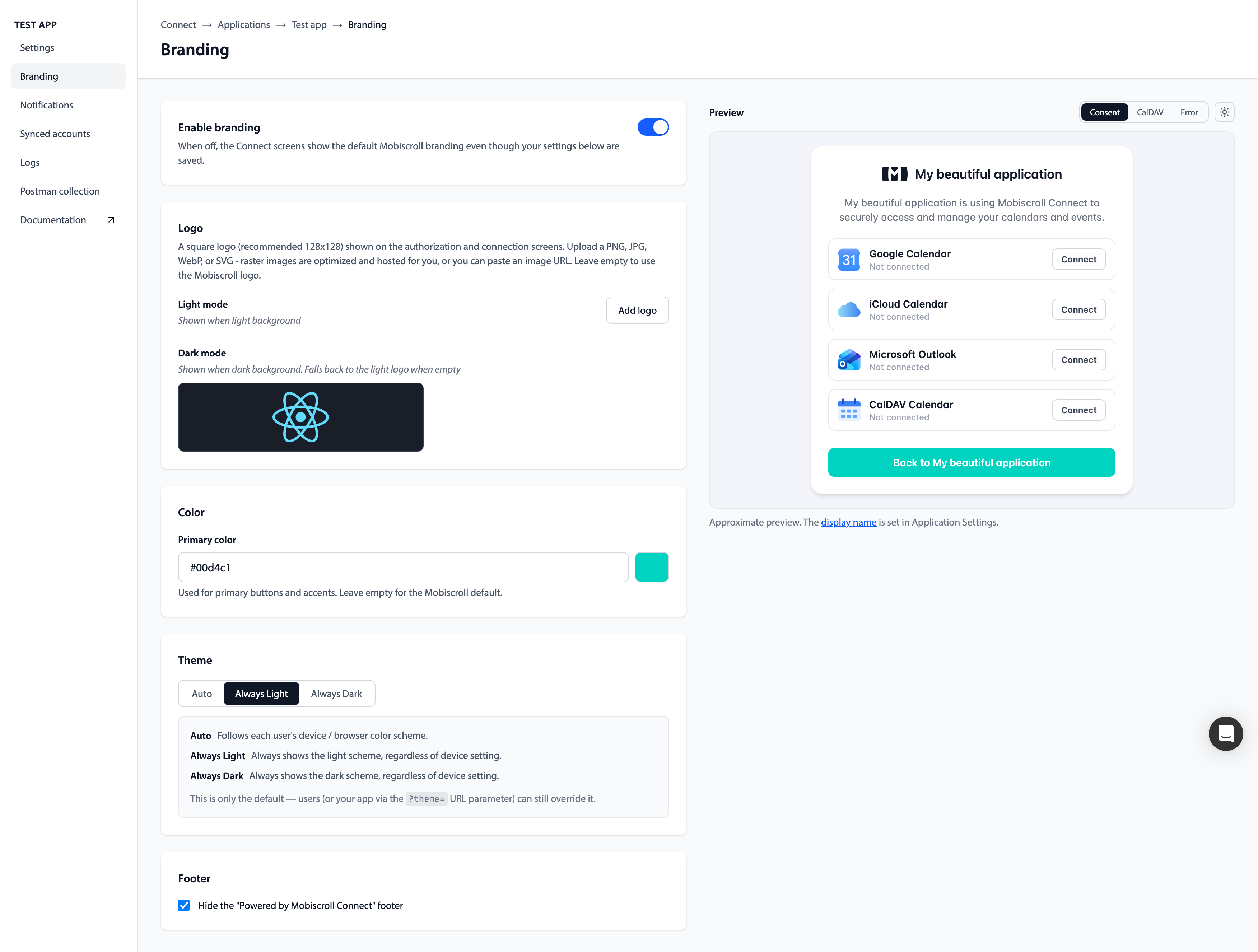
Branding
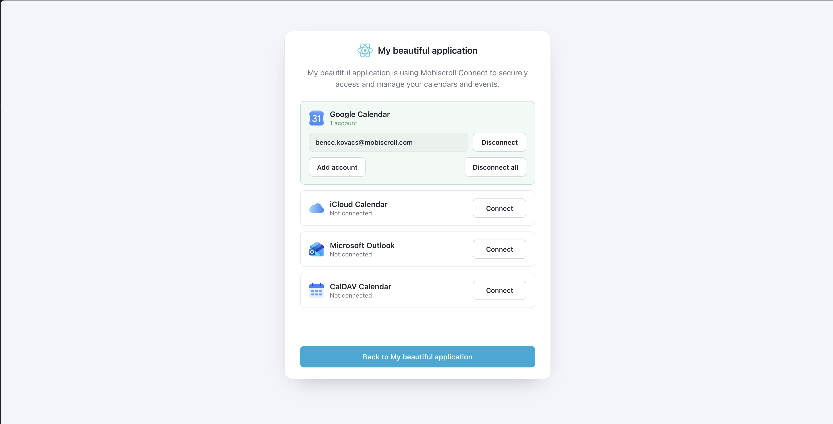
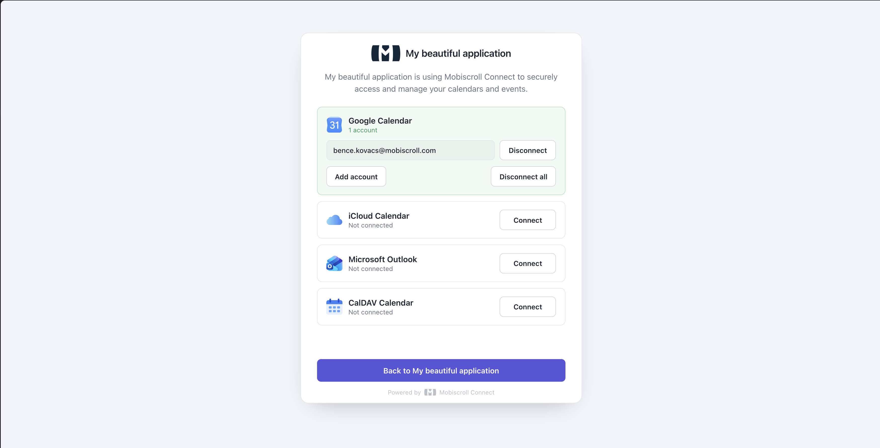
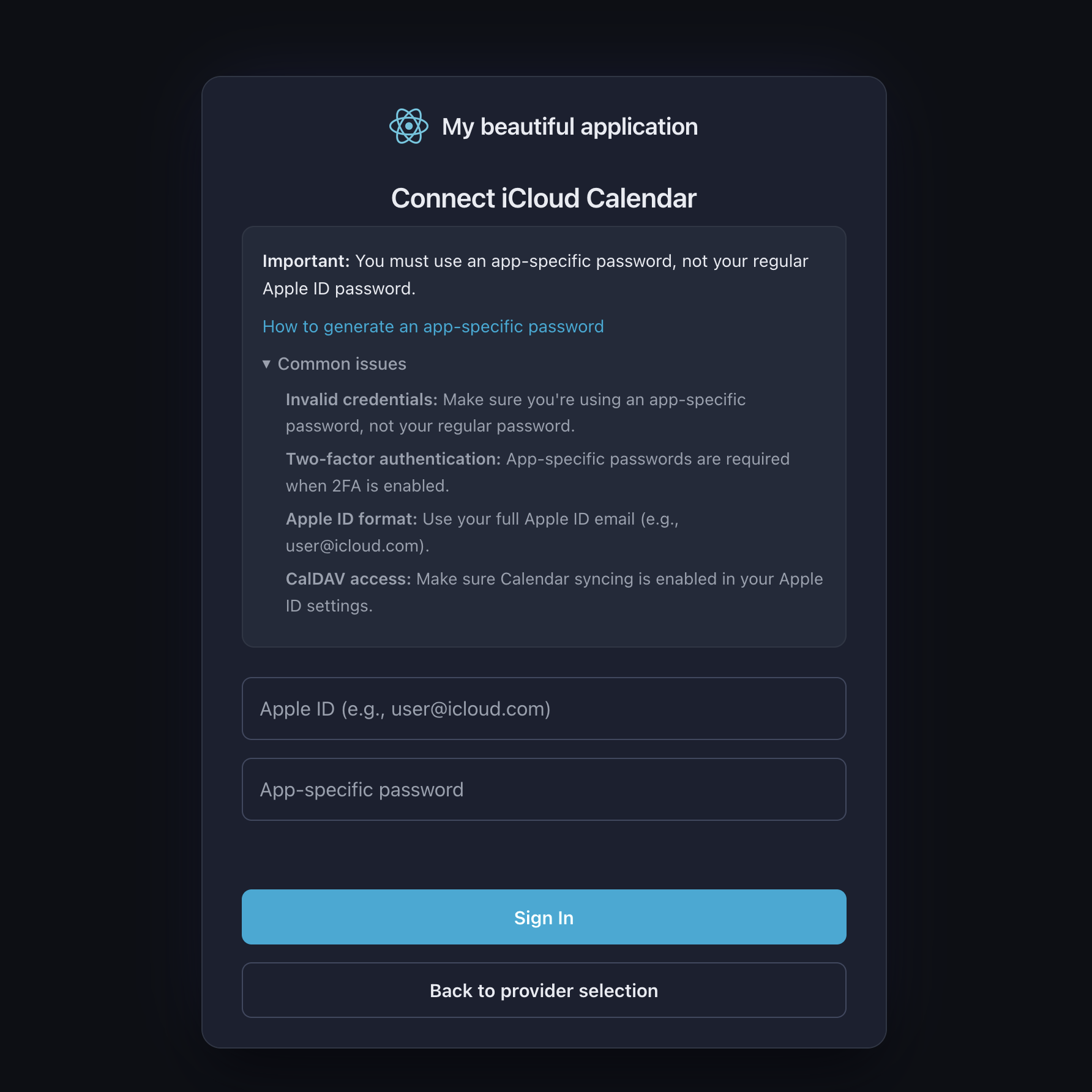
The Mobiscroll Connect screens your users see while linking their calendars - the authorization (consent) screen, the provider login screens, and the error screen - can carry your own logo, color, and theme instead of the default Mobiscroll appearance. Branding is configured per application and applied automatically, so every user who connects through your app sees a consistent set of screens.
Plan availability
Branding is available on the Scale plan or higher.
On lower plans the Connect screens always render the default Mobiscroll branding, and the Branding page in the dashboard shows an upgrade notice instead of the editor. Upgrading to the Scale plan or higher enables the branding fields and applies your saved values to the Connect screens.
What you can customize
Set these from the Branding menu of your application in the Connect dashboard:
- Logo: a square logo (recommended 128x128) shown on the Connect screens. Upload a file (PNG, JPG, WebP, or SVG - optimized and hosted for you) or paste your own hosted image URL. Defaults to the Mobiscroll logo.
- Dark mode logo (optional): an alternate logo used when the dark theme is active. Falls back to the main logo when not set.
- Primary color: a hex color (for example
#5DB4D8) used for primary buttons and accents. Defaults to the Mobiscroll color. - Theme: the default color scheme -
auto,light, ordark. See Theme precedence below. - Hide footer: hide the "Powered by Mobiscroll Connect" footer.
All fields are optional. Anything left empty falls back to the Mobiscroll default.
How branding is applied
Branding is resolved from the client_id in the authorization request and injected into the Connect screens automatically. You do not pass any branding parameters and you do not change your integration - once branding is saved for an application, every authorization flow started with that client_id uses it.
The enable branding switch on the Branding page controls whether your saved customization is actually applied - turning it off reverts the same screen to the default Mobiscroll appearance without discarding your settings:
Theme precedence
The Theme field sets the default color scheme for your screens: auto follows each user's device setting, while light and dark force a fixed scheme.
The default is not the only input. The resolved scheme is chosen in this order, highest priority first:
- The
themequery parameter on the authorize URL (?theme=light,?theme=dark, or?theme=auto), sent by the calling application. - The application's Theme default, when it is set to
lightordark. - The user's remembered choice on the screen - applied only when the application default is
auto. auto(the device setting), as the final fallback.
Display name and support contact
The application's display name and its support email / support URL are shown on the same Connect screens, but they are not branding fields - they are configured on the Application Settings page and are available on every plan.
- The display name identifies your app to the user on the authorization and connection-management screens, and on the "Back to" return button.
- The support email or URL appears as a "Need help?" contact on the error screen. When neither is set, the error screen tells the user to contact their system administrator.
See the Application Setup Guide for where to set these.